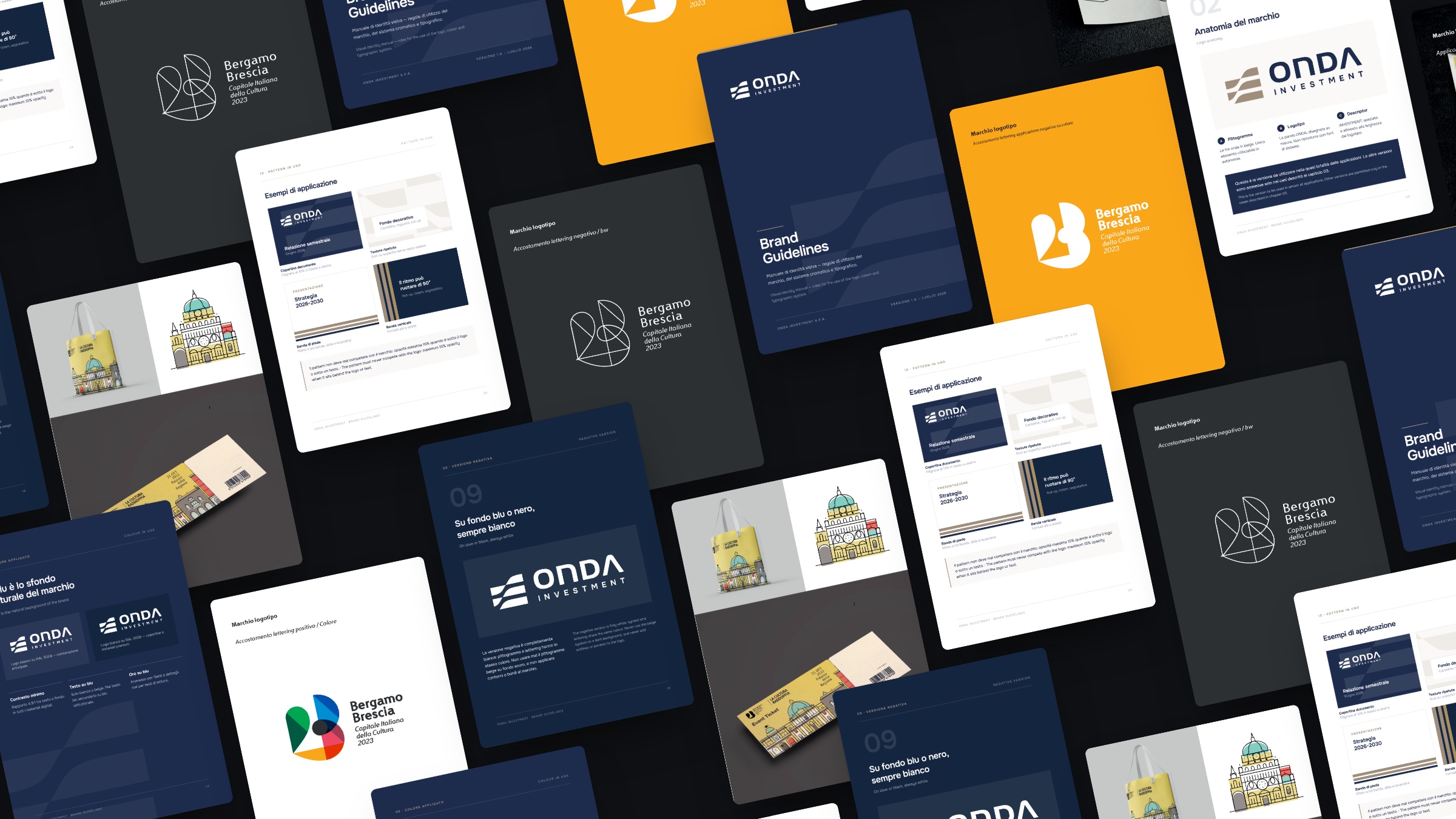
Brand identity
Logos, visual systems and brand guidelines: we design identities that stay recognisable in every medium, from business cards to websites.
Our approach
A brand is a system, not just a drawing.
We start from the company’s values and the audience it speaks to, explore several directions and compare them in clear presentations. Once the route is chosen, we build everything needed to use it well: grids and proportions, logo versions, palette, typography, patterns, iconography, tone of voice and usage rules, all collected in a set of guidelines.
01 · Onda Investment
Solidity, growth and continuity.
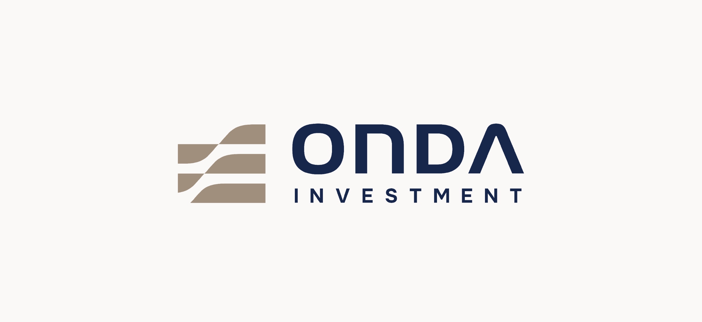
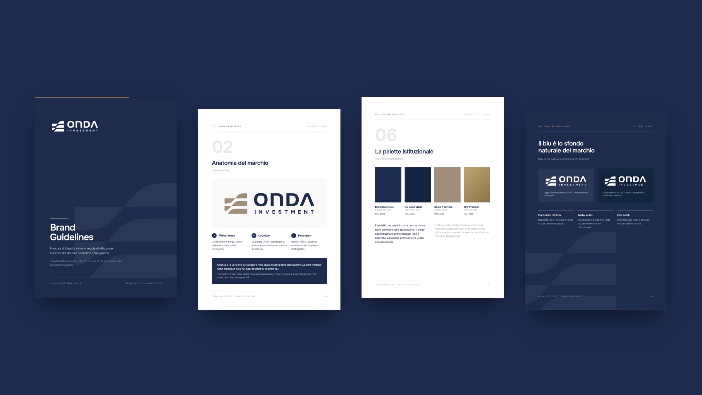
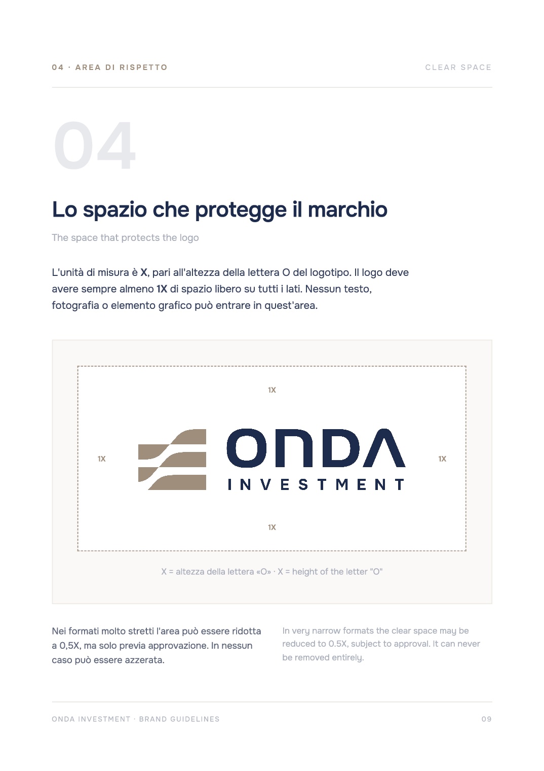
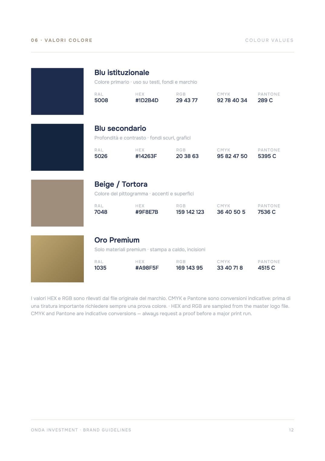
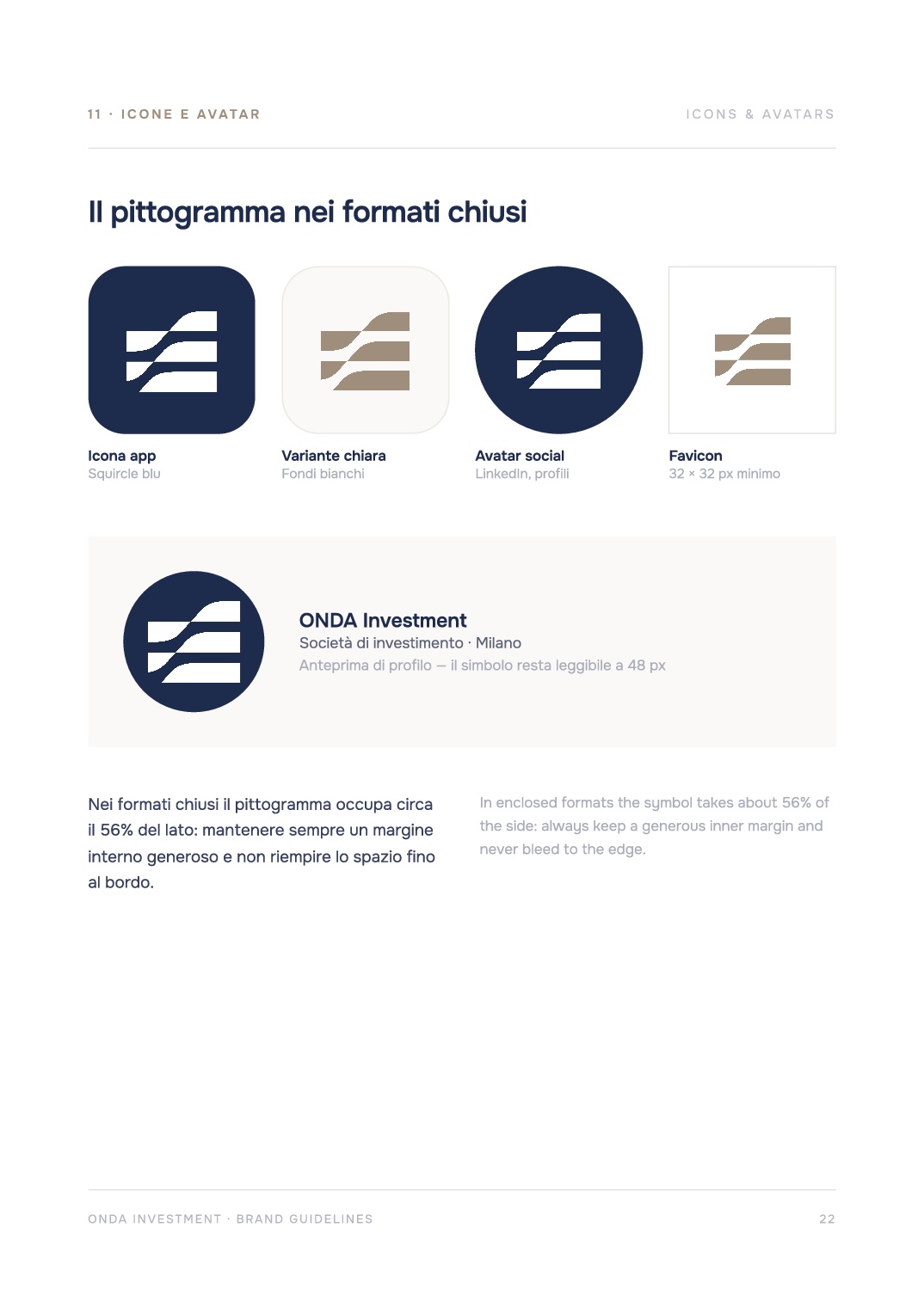
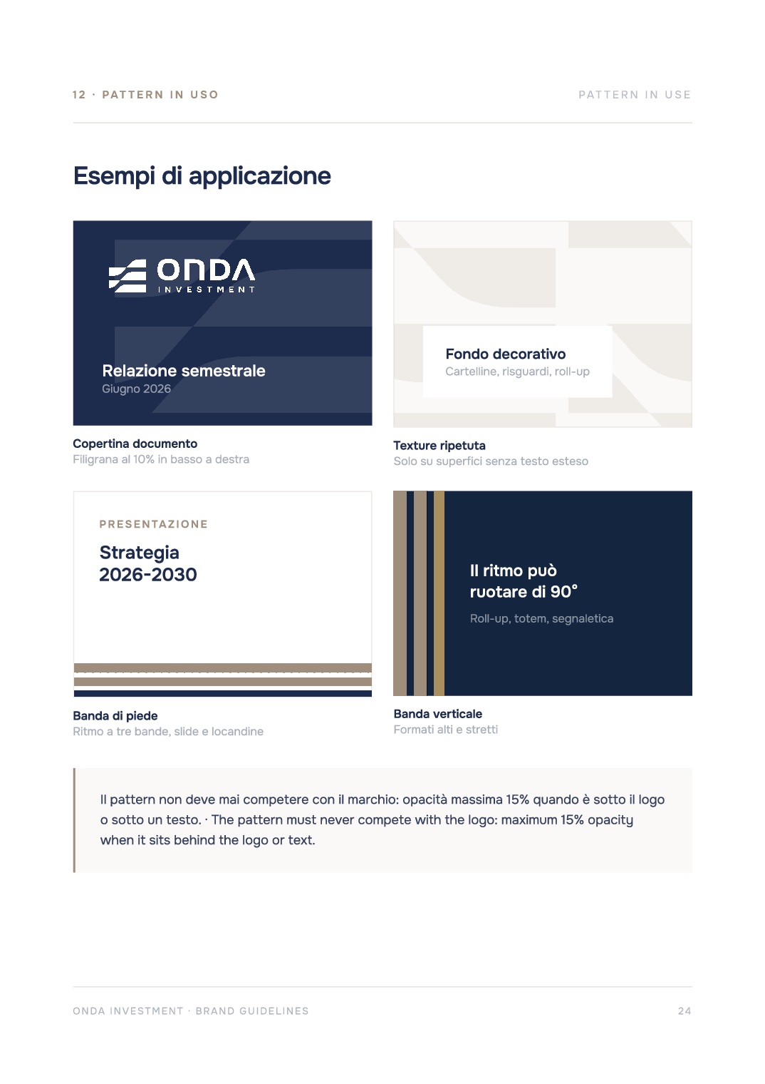
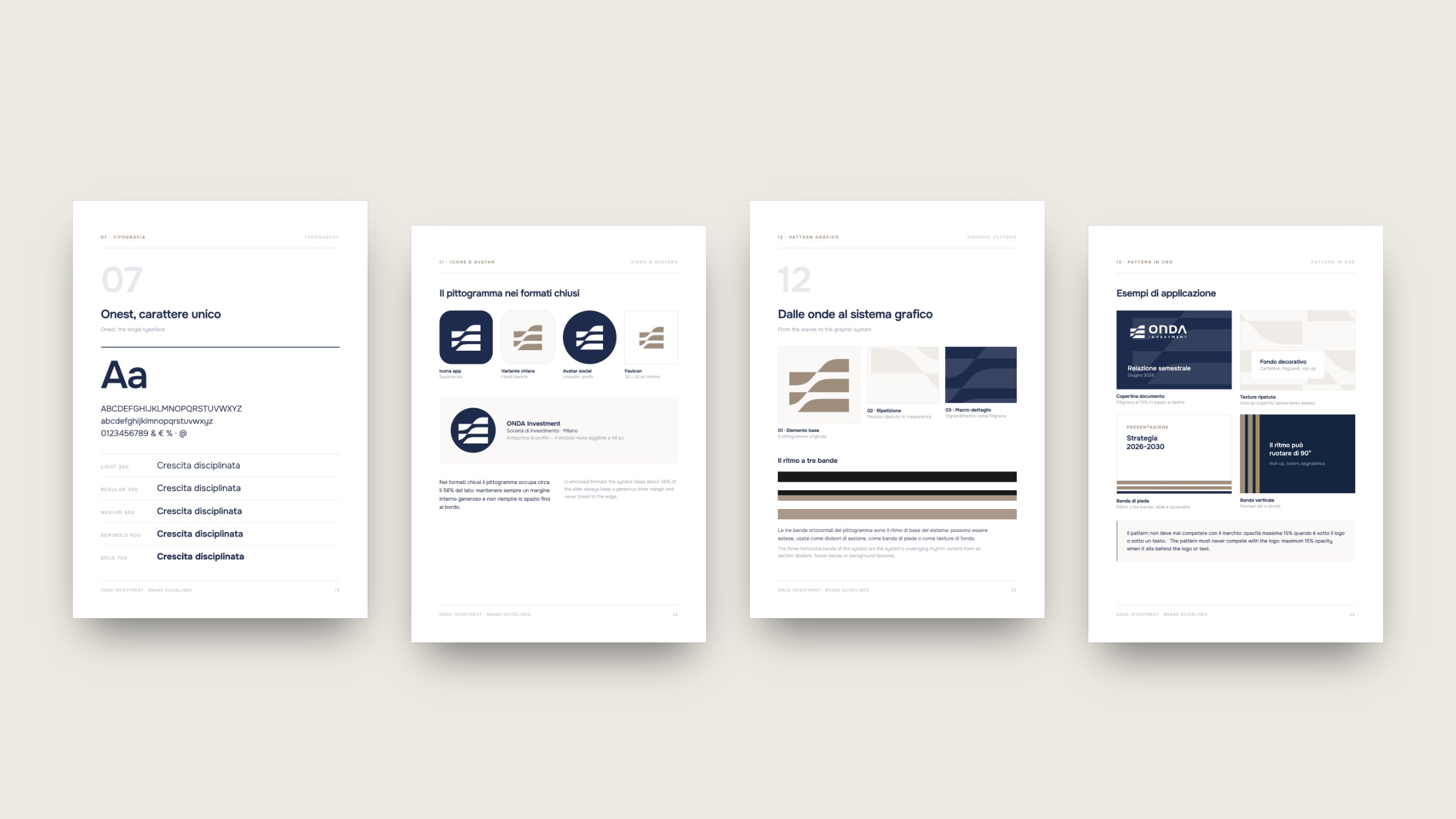
For the investment firm Onda Investment we designed the visual identity and the guidelines that govern its use. The pictogram of overlapping waves expresses steady growth and continuity; institutional blue and taupe beige, with a gold accent, give the brand a sober, trustworthy tone.
- 01
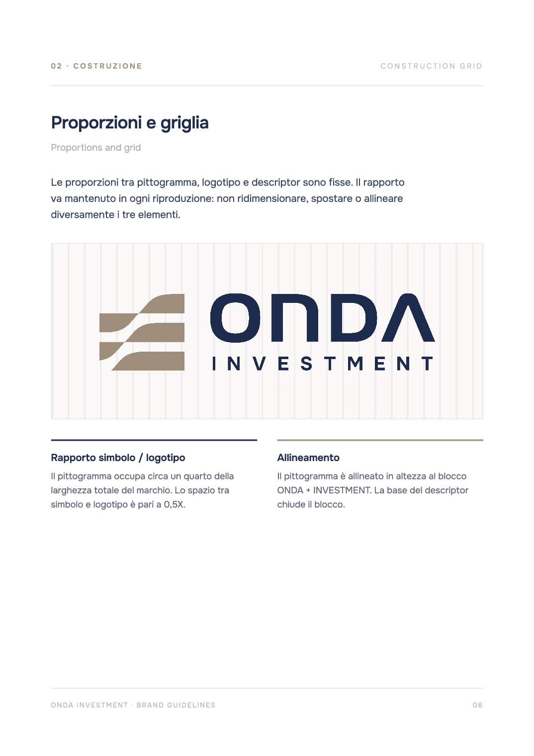
Anatomy of the brand
Pictogram, logotype and descriptor, with proportions and construction grid.
- 02
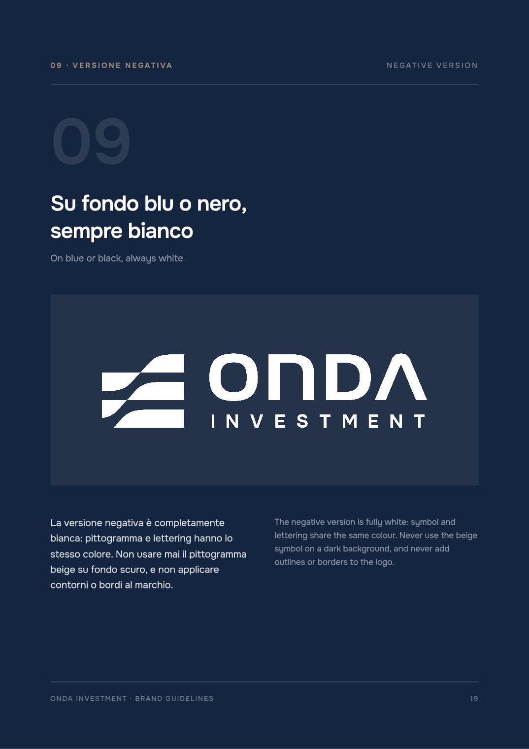
Four official versions
Institutional, monochrome, white and black, with clear space and minimum sizes.
- 03
Colour and typography
Primary and secondary palettes with values for print and digital; the Onest typeface with a type scale.
- 04
Graphic system
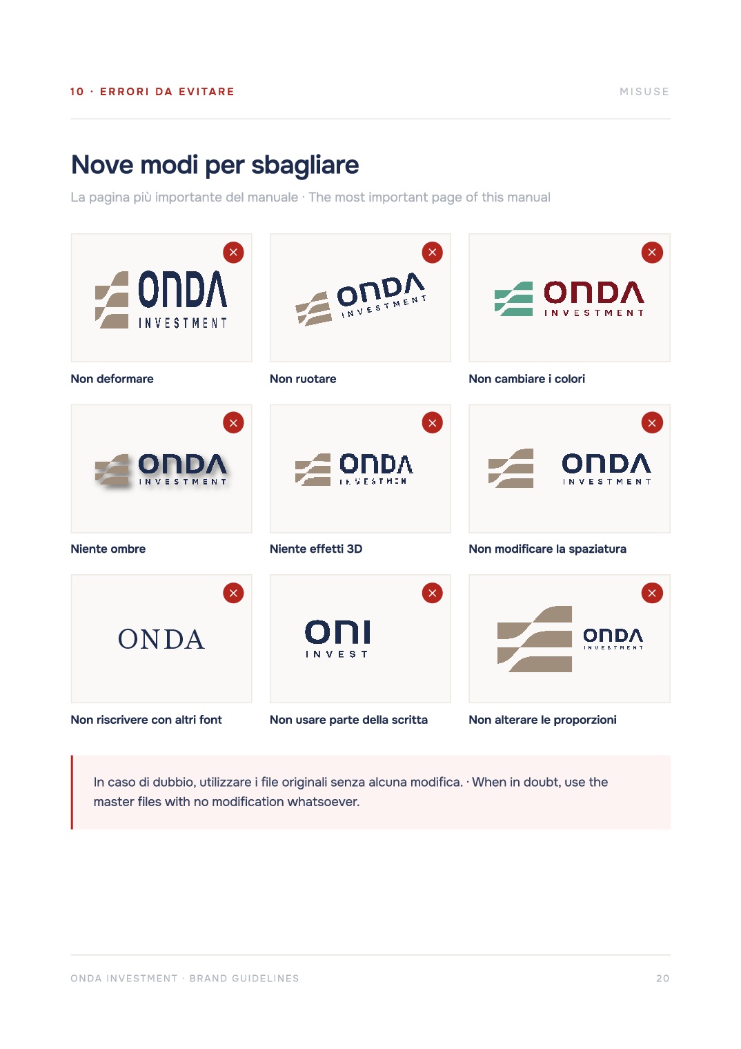
Wave and band patterns, line iconography, permitted backgrounds, misuses to avoid and tone of voice.
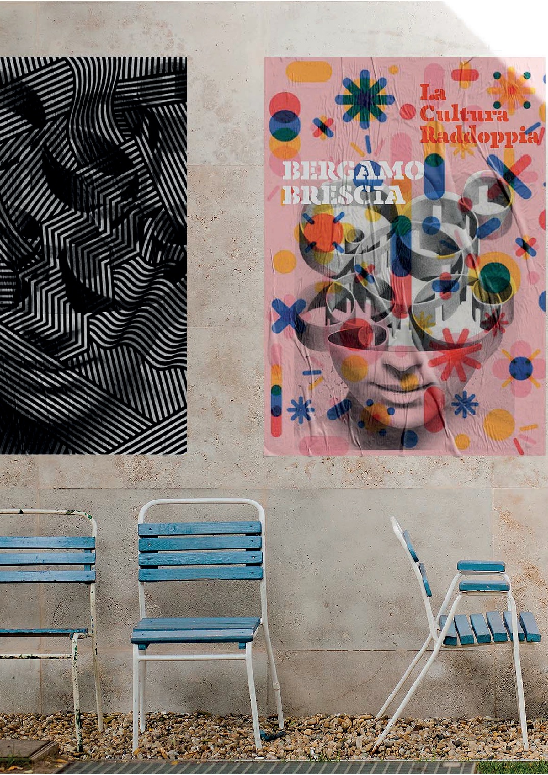
02 · Bergamo Brescia 2023
Culture doubles.
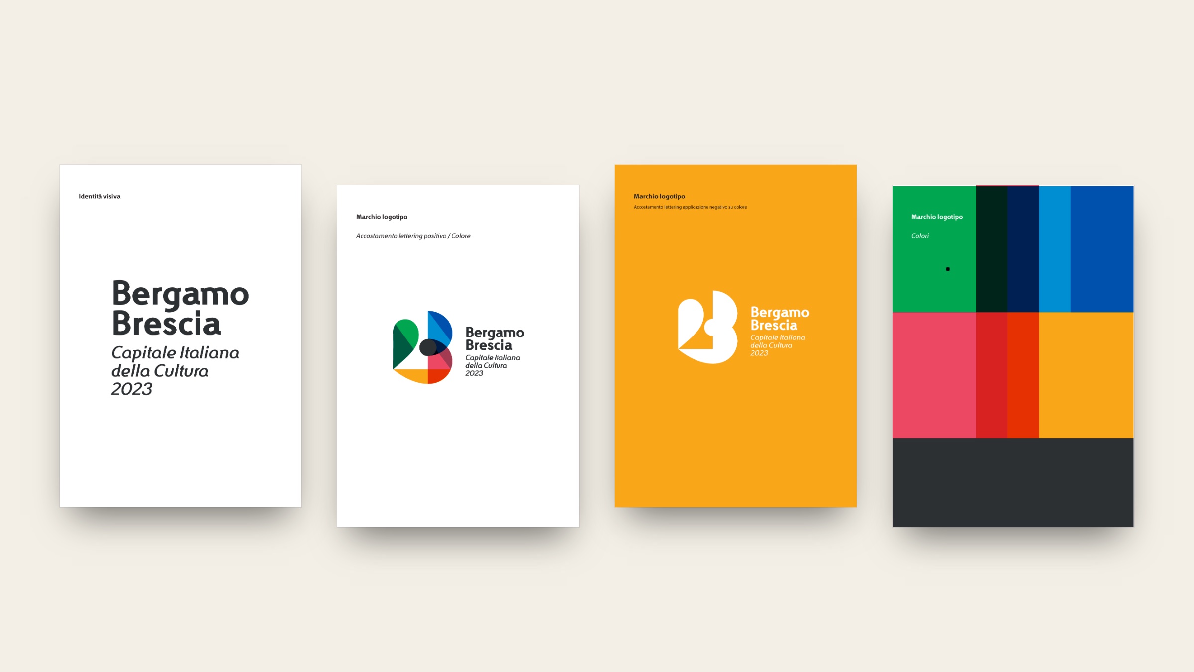
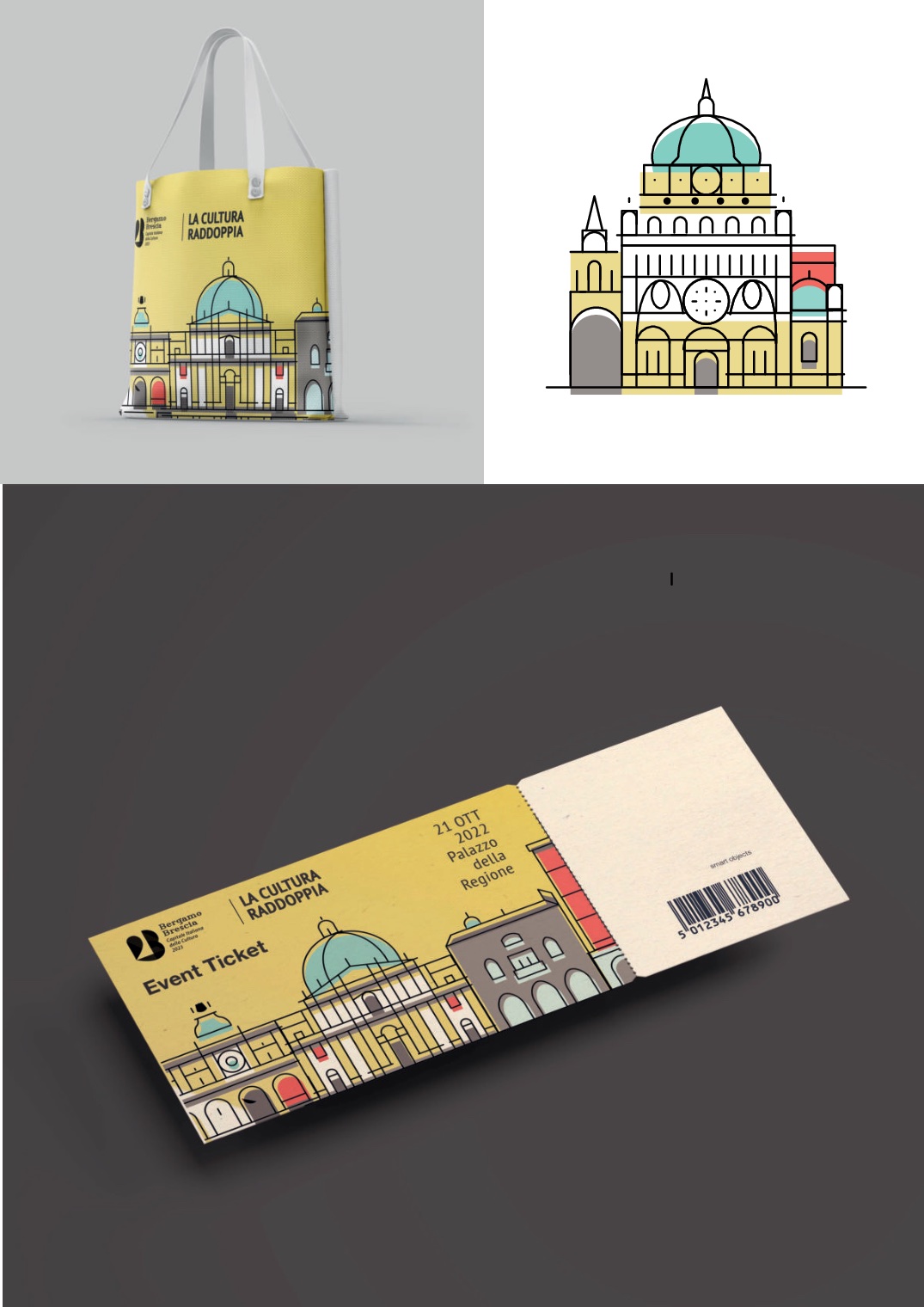
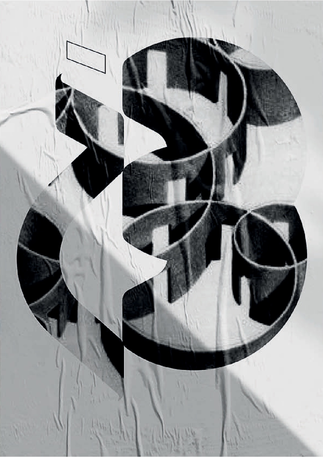
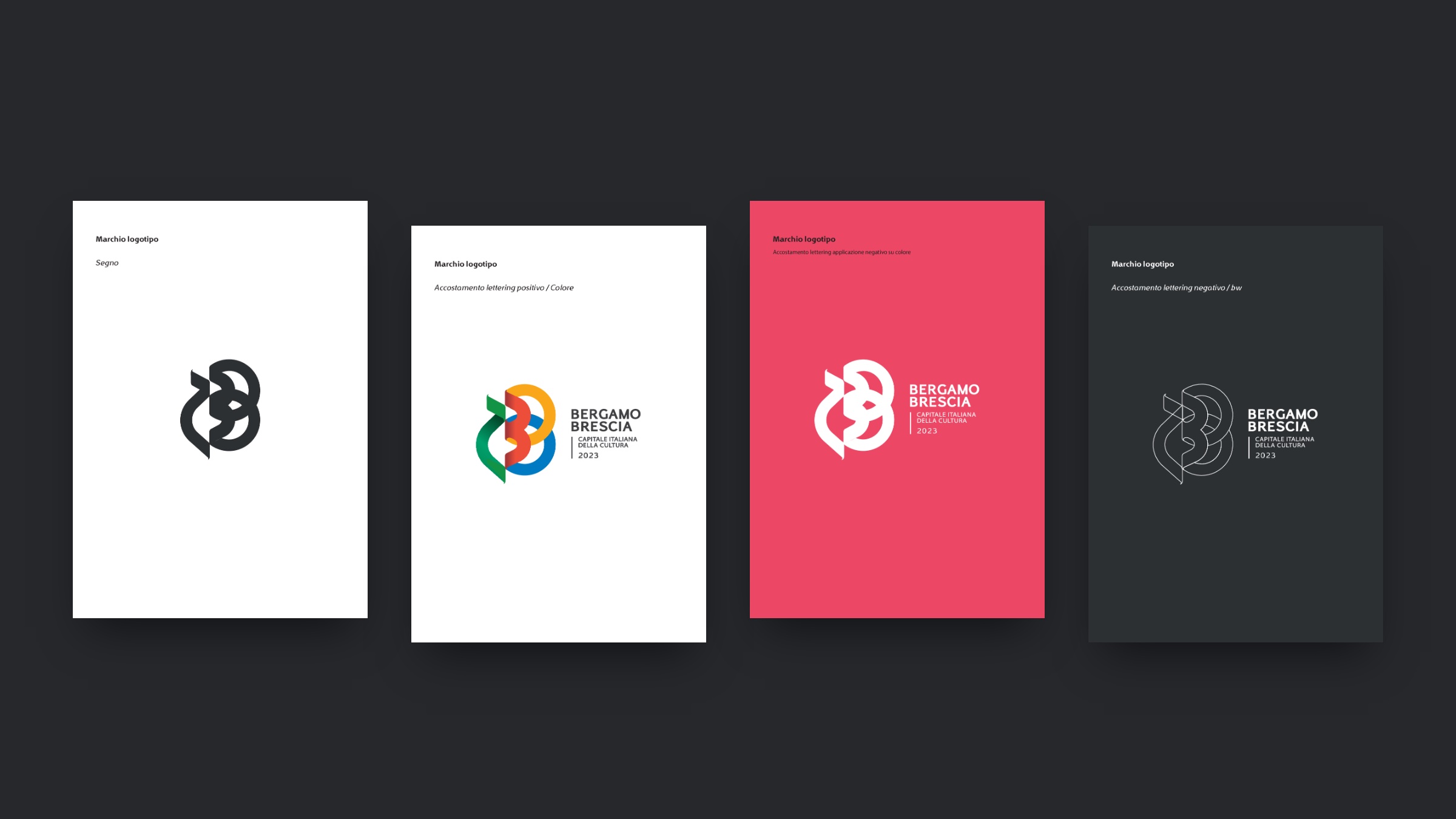
A visual identity concept proposed for Bergamo Brescia Italian Capital of Culture 2023. Two cities joining forces to start again together: hence the payoff and two logo proposals built on the theme of duality.
Proposal 1
Fluid, rounded lines in which you can read the 2, the initial B of both cities and the 23 of the year.
Proposal 2
Soft, dynamic lines: the two, the three and the curves of the B form 2023 and two joined Bs.
Colour
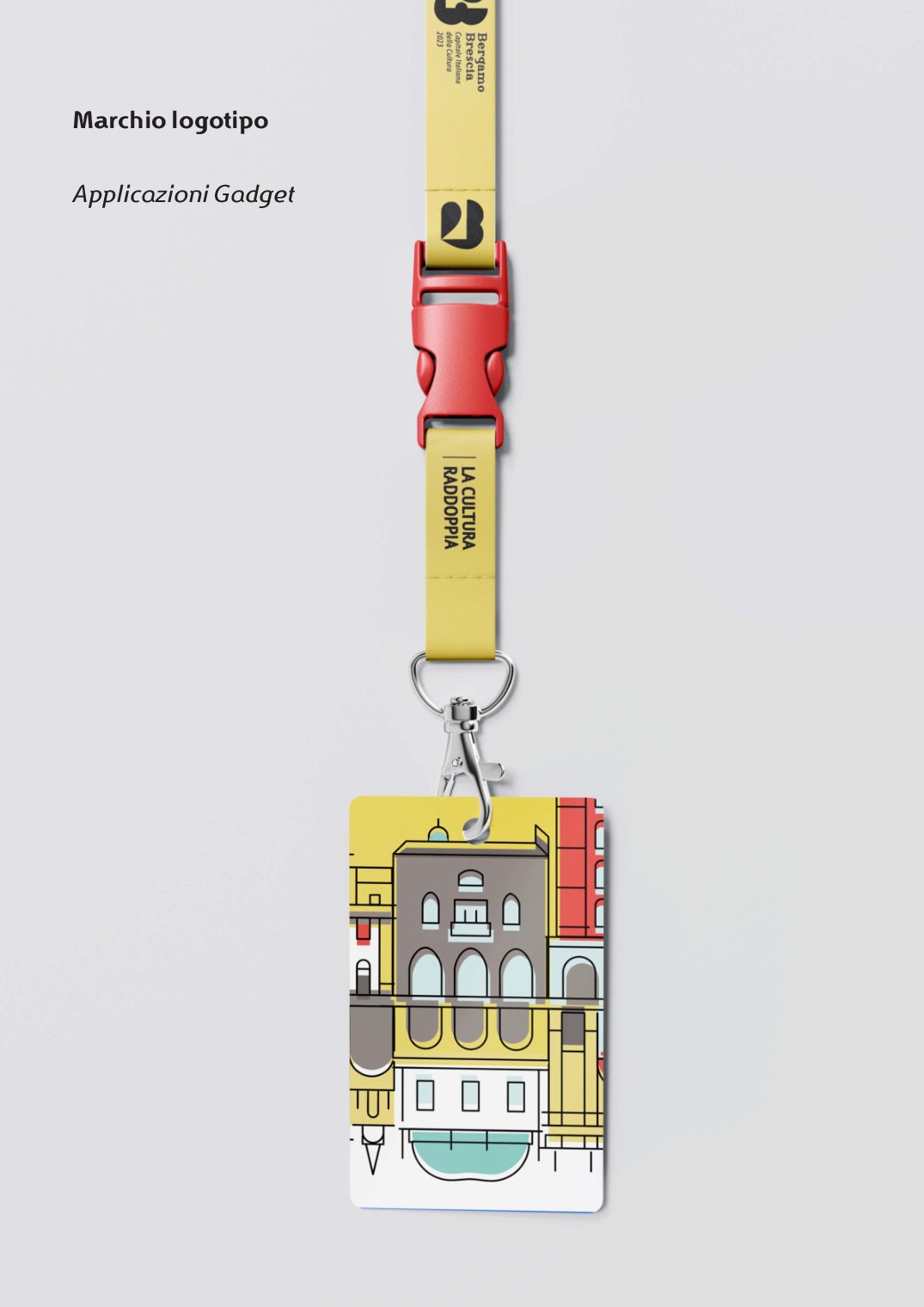
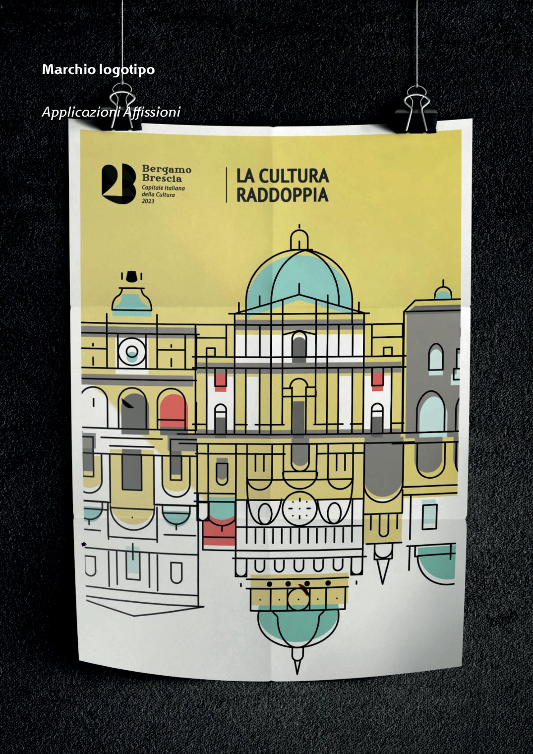
Green for hope and rebirth, light blue for Brescia, red and yellow for Bergamo.
Applications
Positive and negative variants, typography, shopping bags, tickets, badges, posters and billboards.
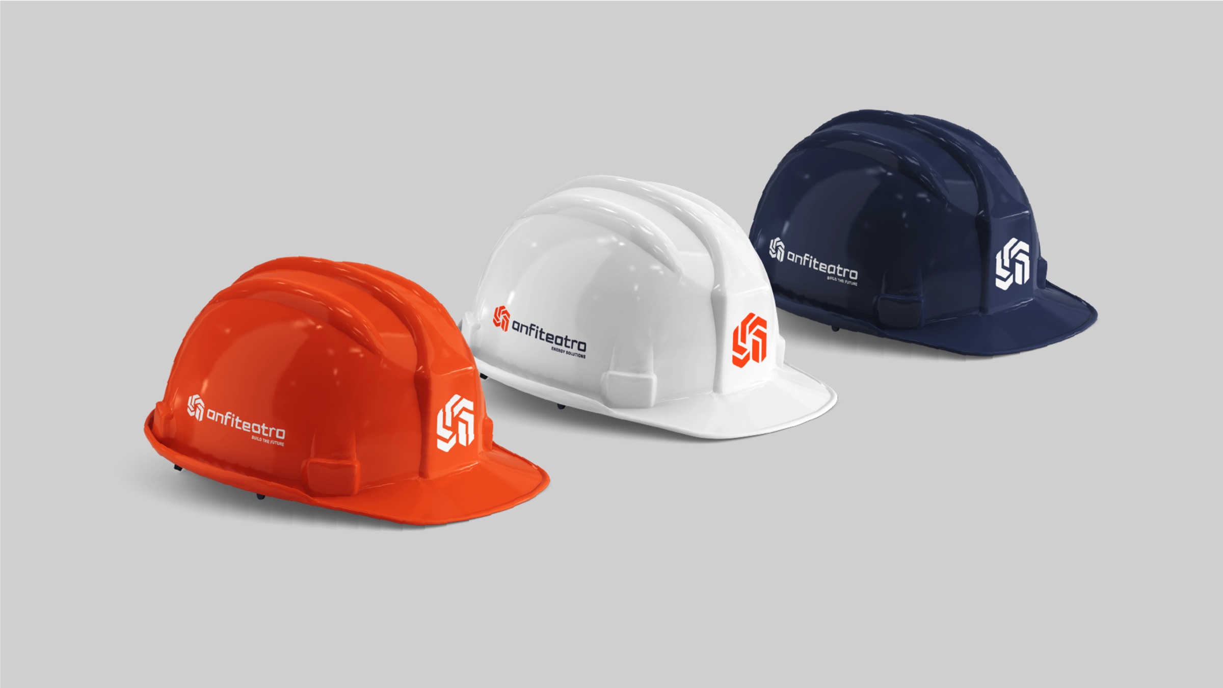
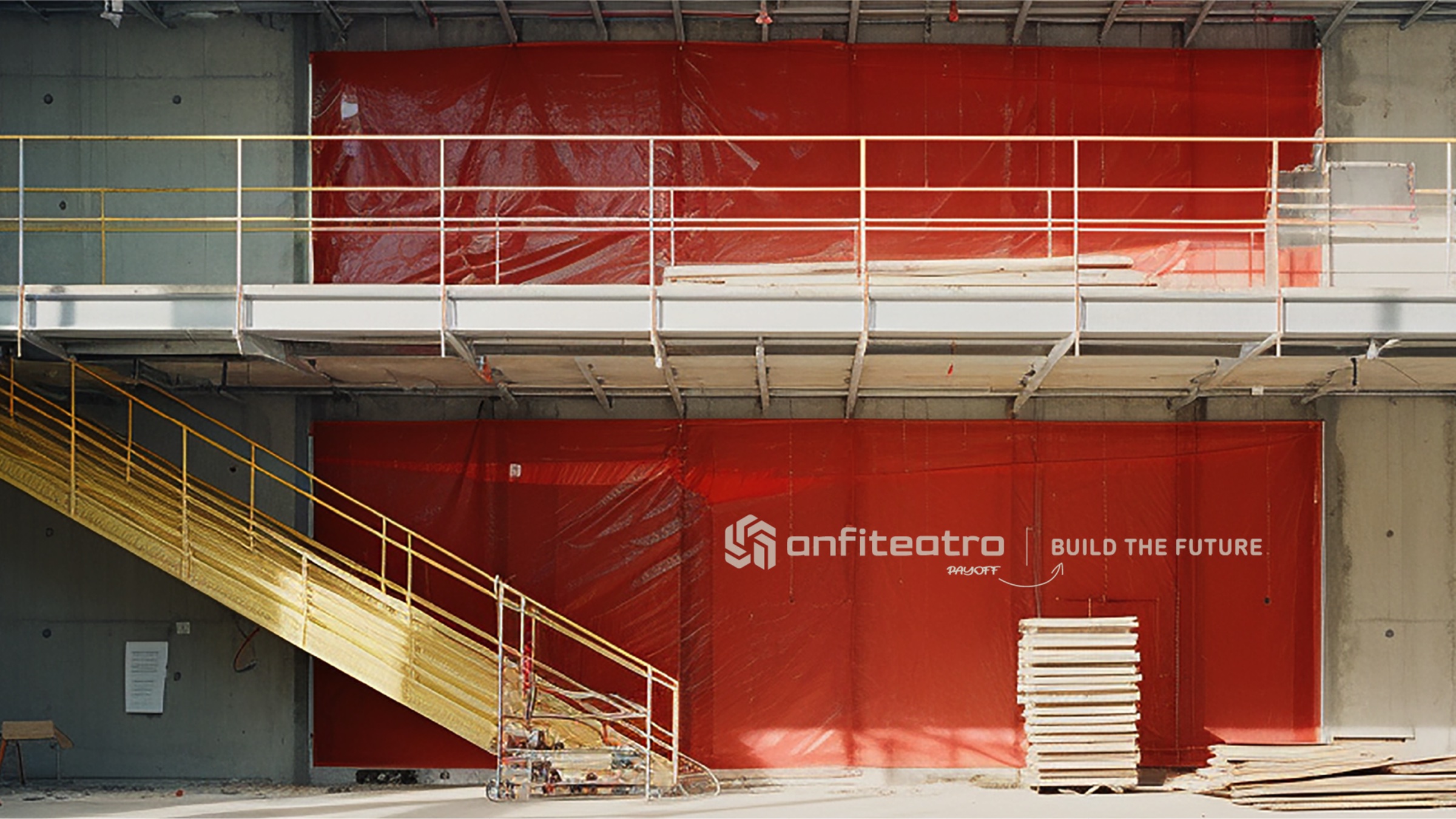
03 · Anfiteatro
A new name to build the future.
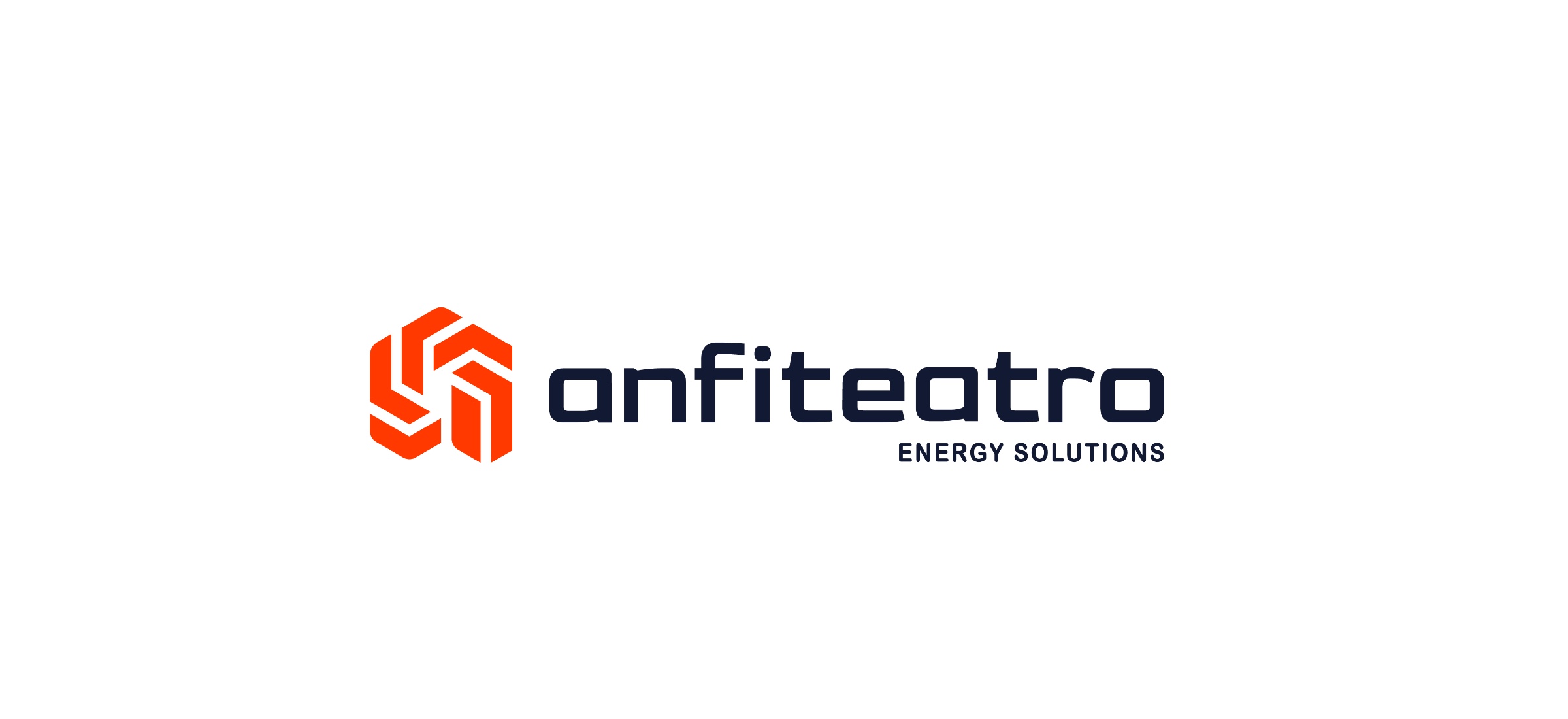
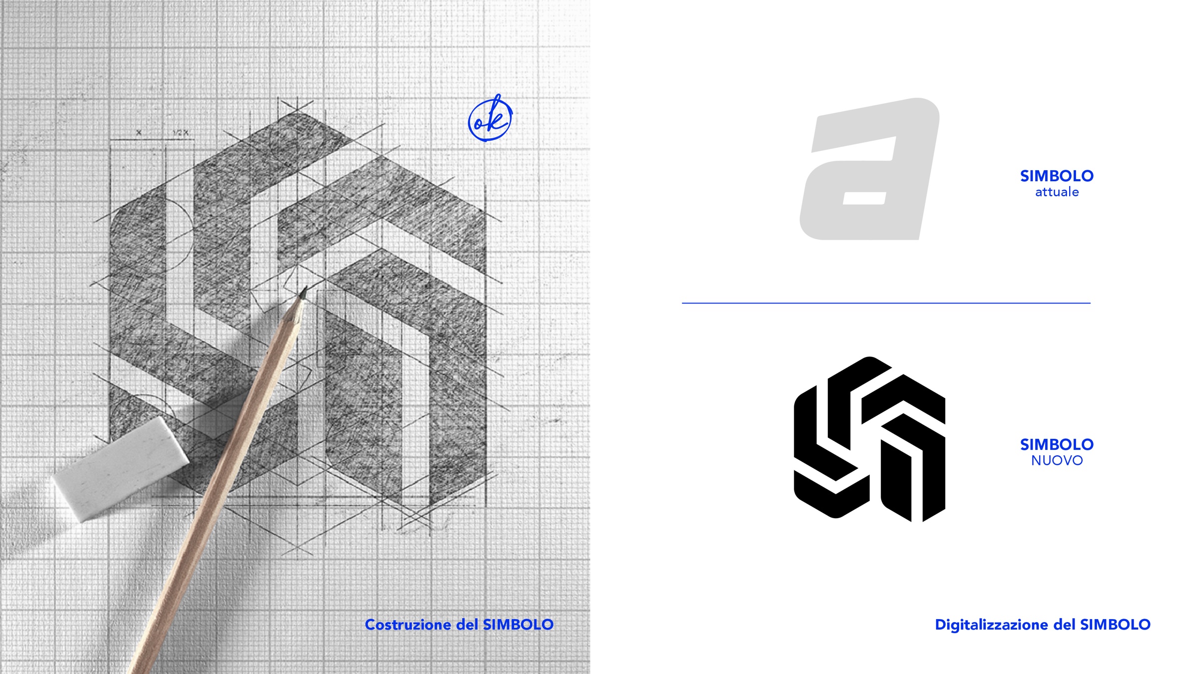
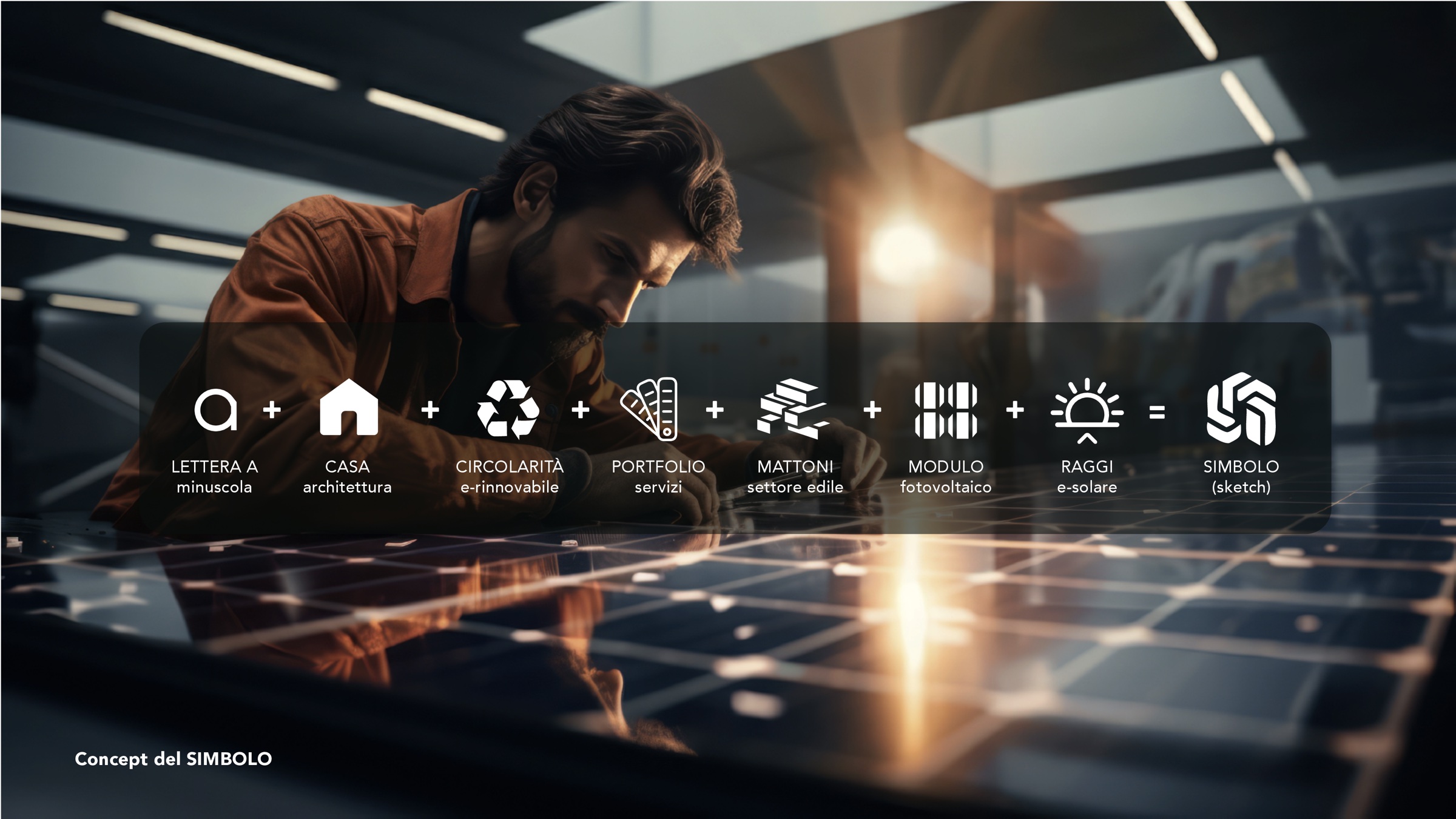
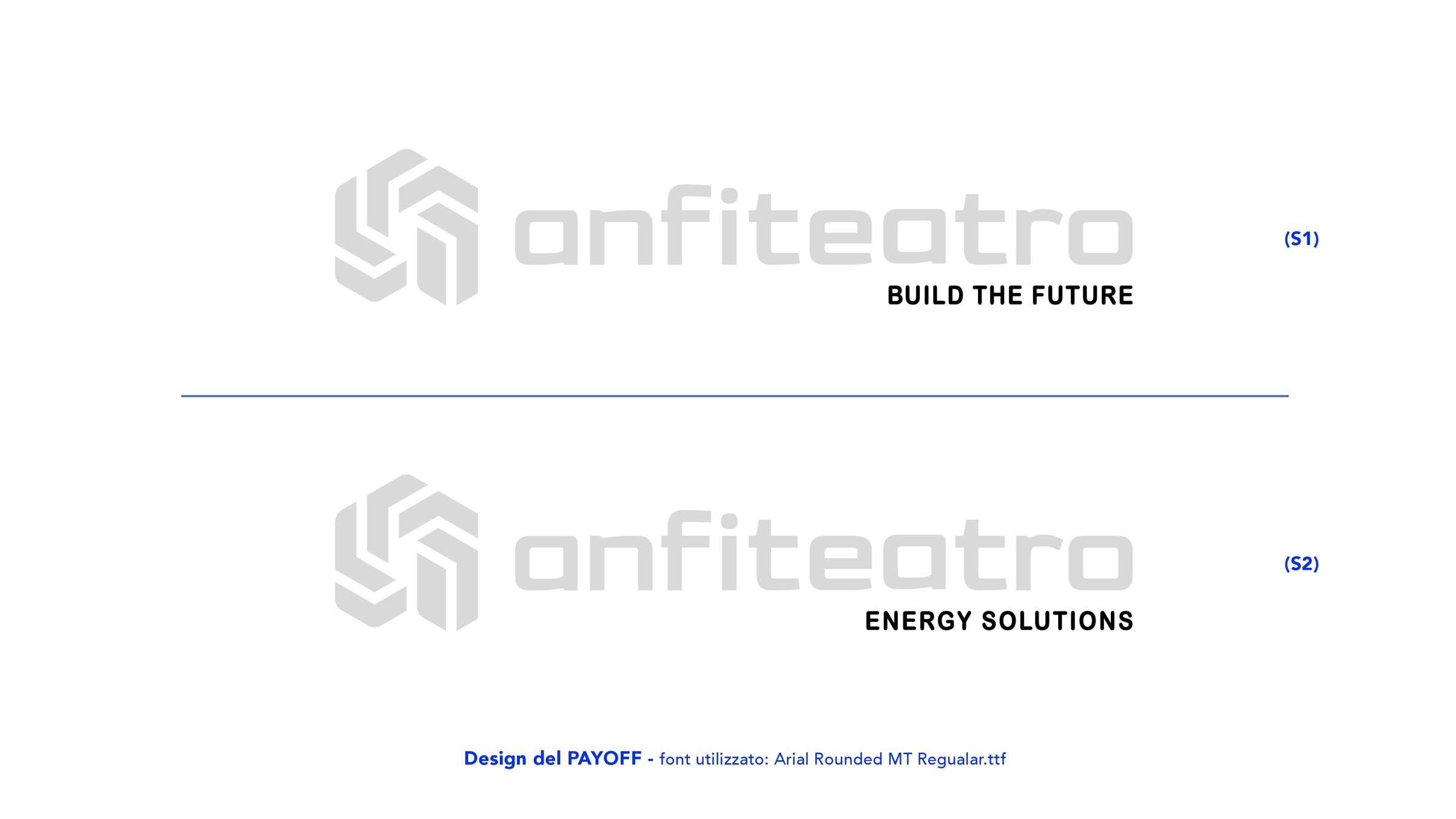
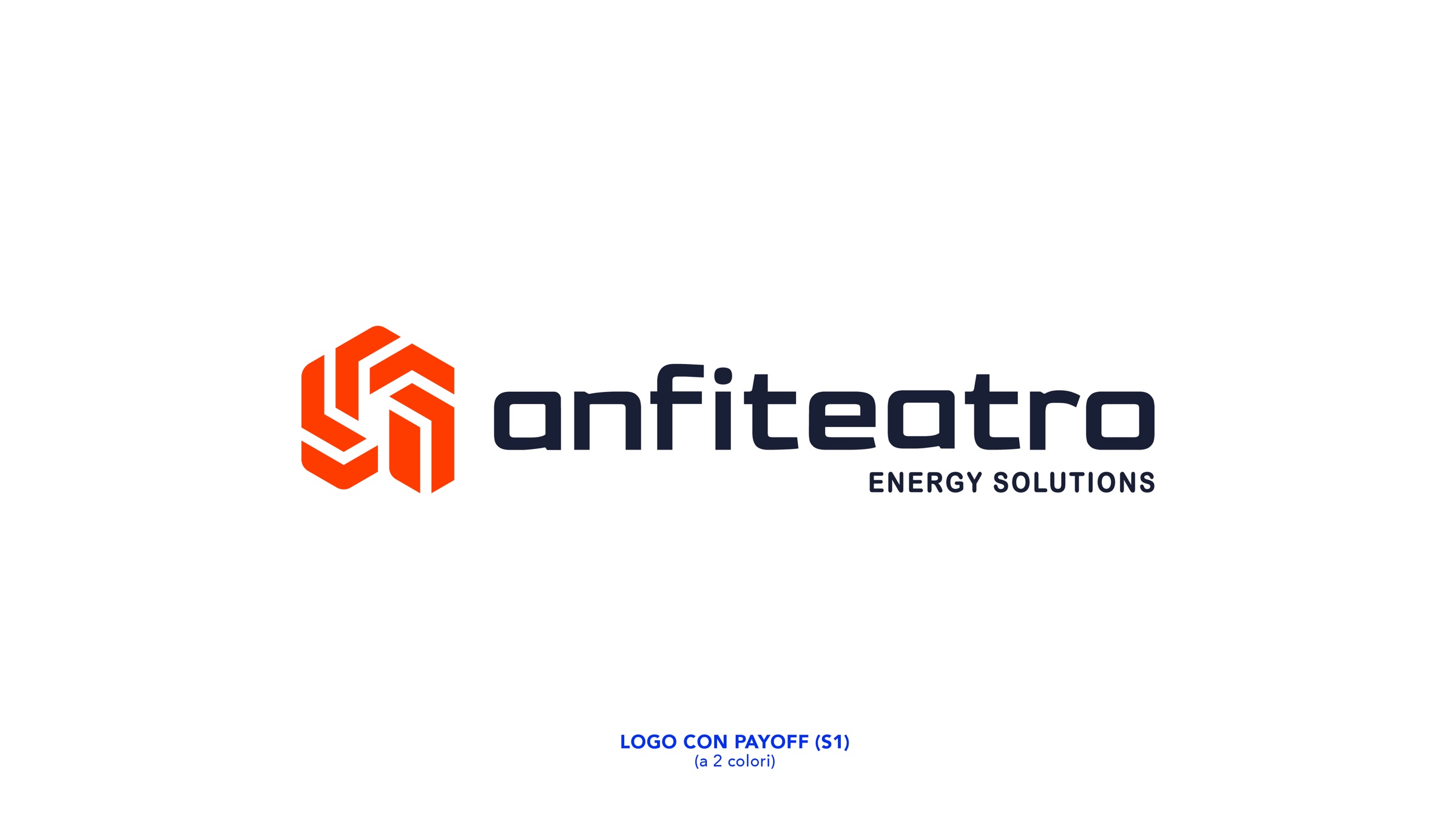
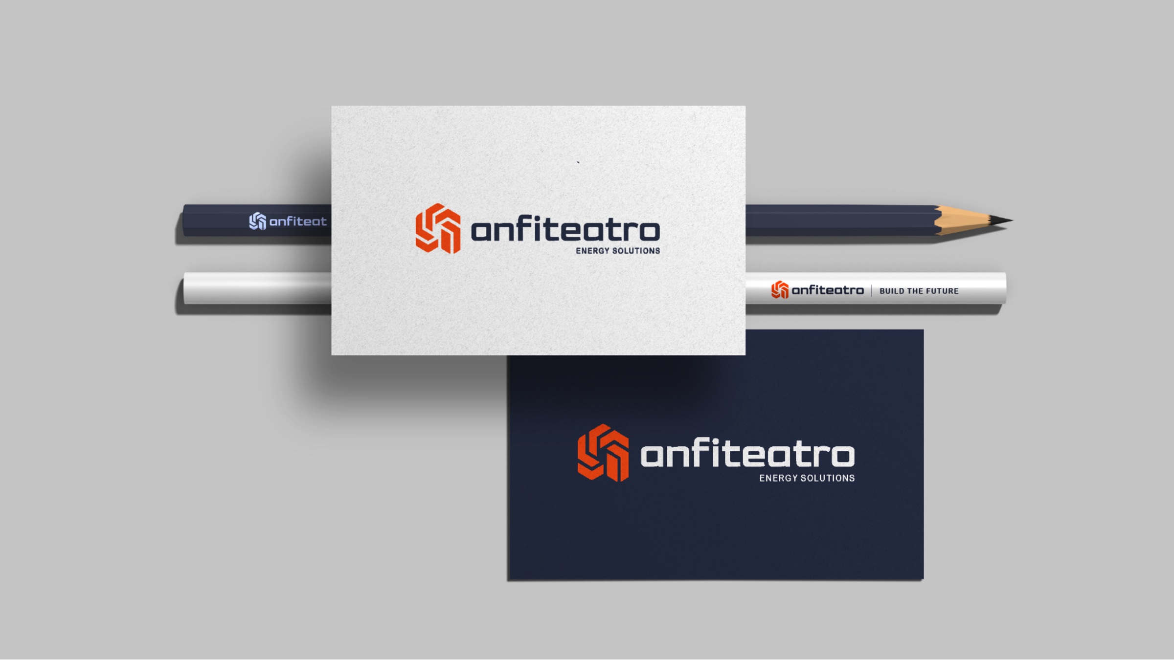
A complete rebrand for Anfiteatro Sebino 2, a construction company that has grown into solar power and energy: brand analysis, a simplified name, symbol, custom logotype, the payoffs Build the future and Energy solutions, colours and building-site applications.
Let’s talk
Let’s give shape
to your brand.
New brand or restyling: tell us about your company and we’ll come back with first creative directions, with clear timings and costs.