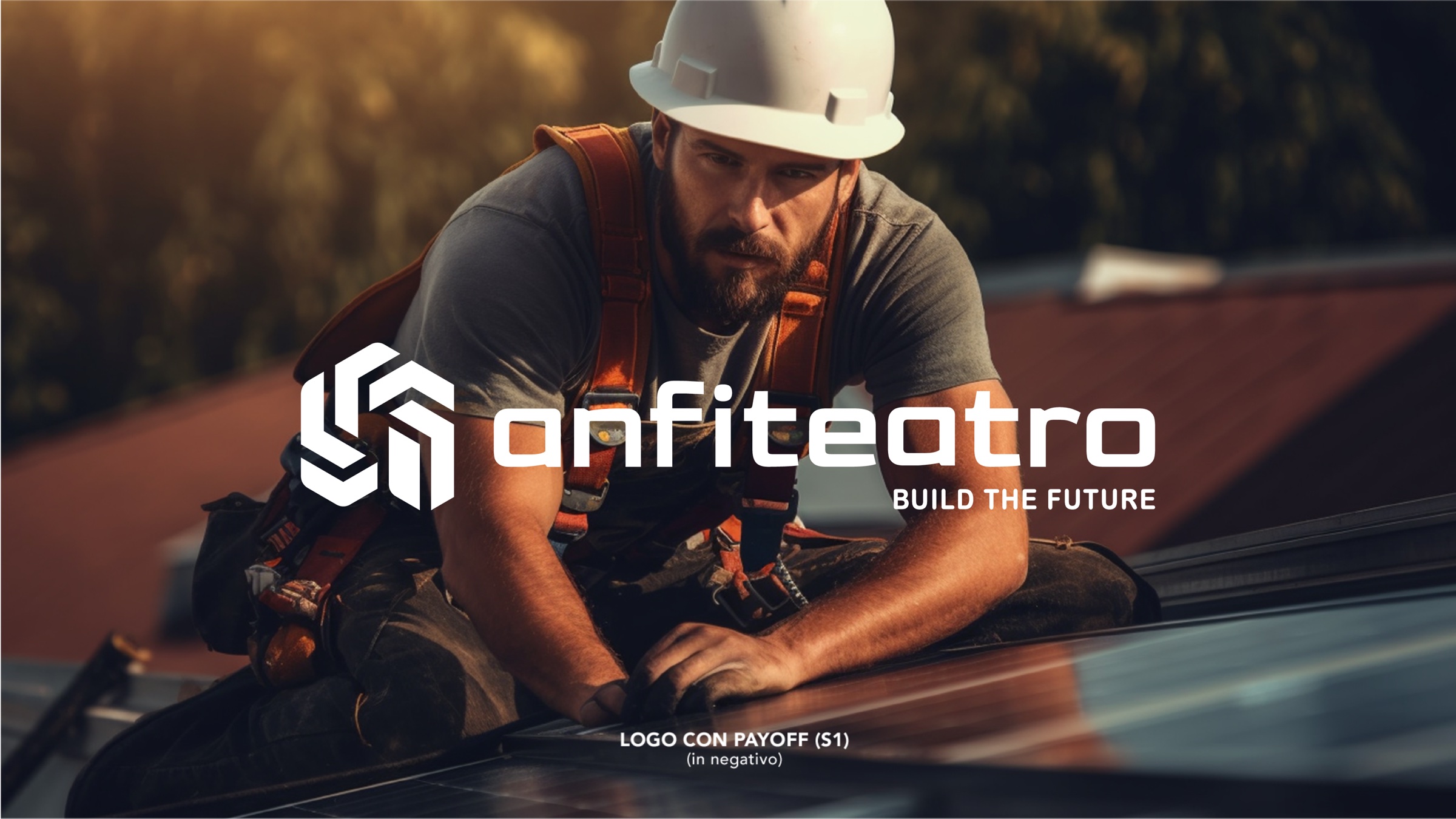
Anfiteatro
A complete rebrand for a construction and energy company: name, symbol, logotype, tagline and colours, all the way to the building site.
The context
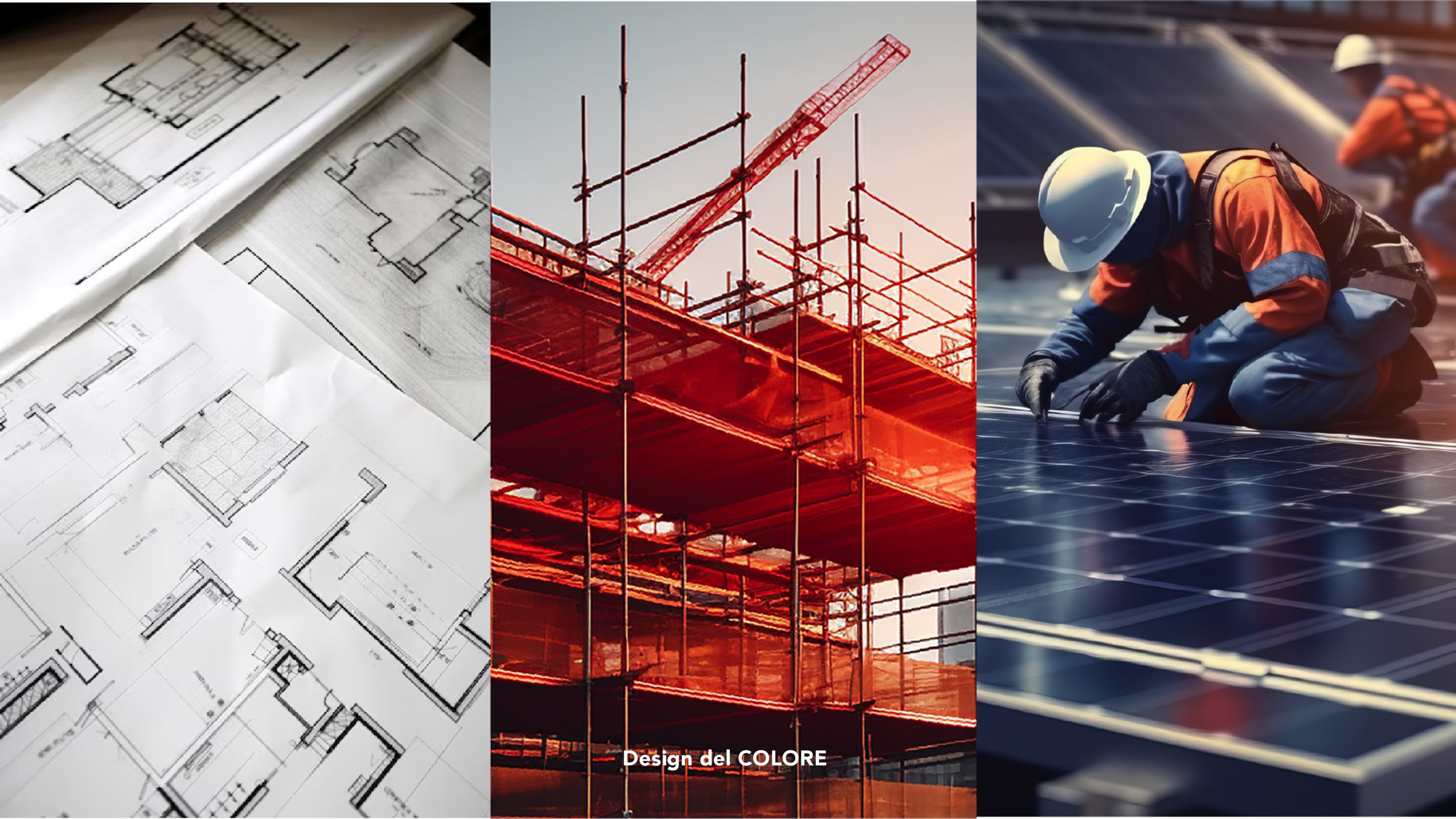
A company that had grown beyond construction, into solar and energy. The brand had to show who it is today, not who it was yesterday.
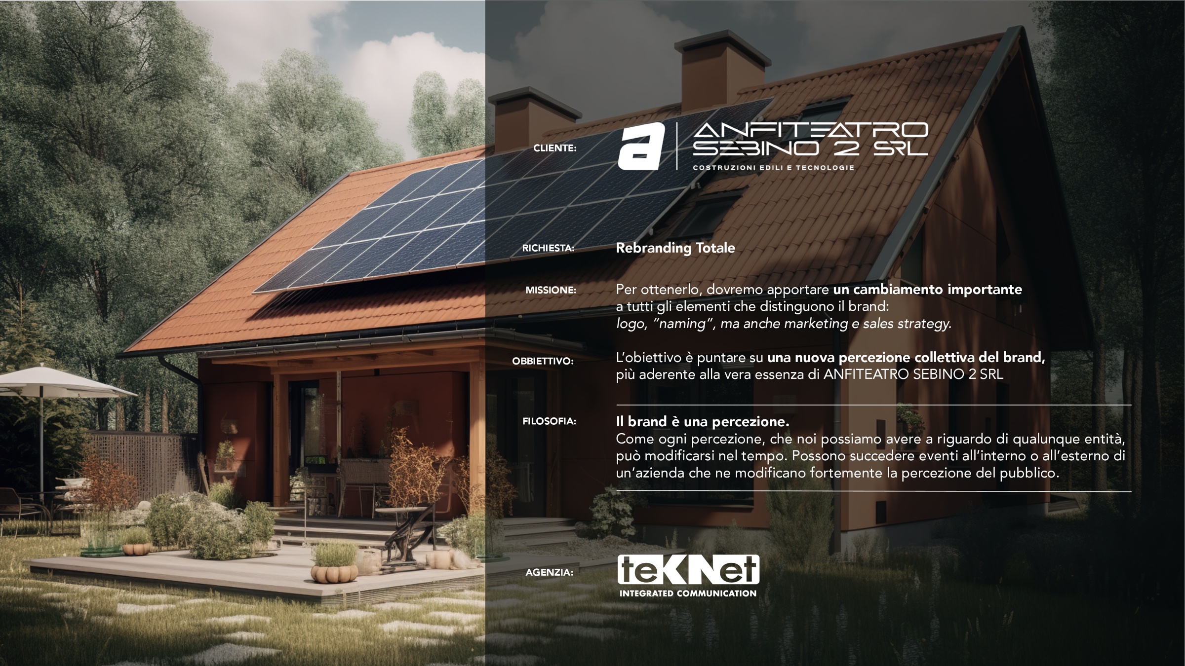
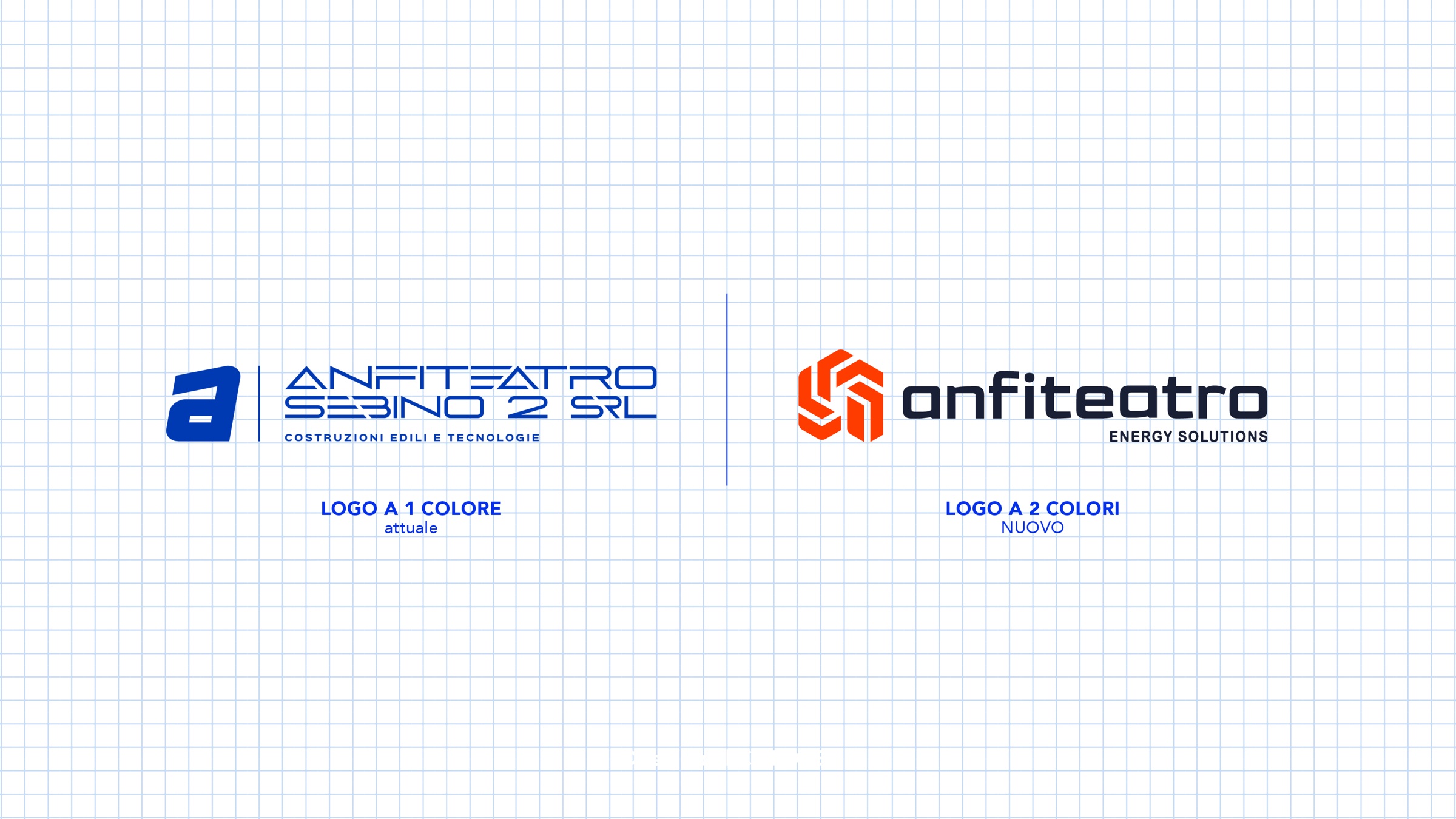
For Anfiteatro Sebino 2 we handled a complete rebrand: an analysis of the existing mark, a simplified name, a new symbol, a custom logotype, tagline and palette, presented in boards that take the client from the first idea through to applications. The goal: a new perception of the brand, truer to what the company really is.
The challenge
The knots to untie.
- 01
A long, hard-to-read name
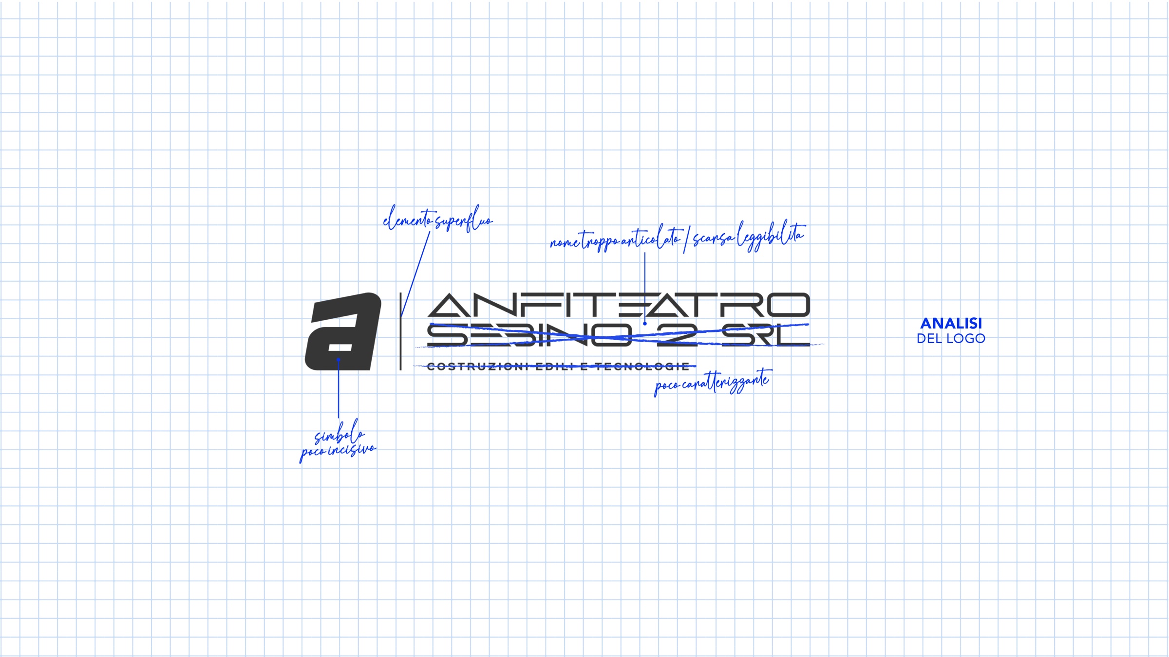
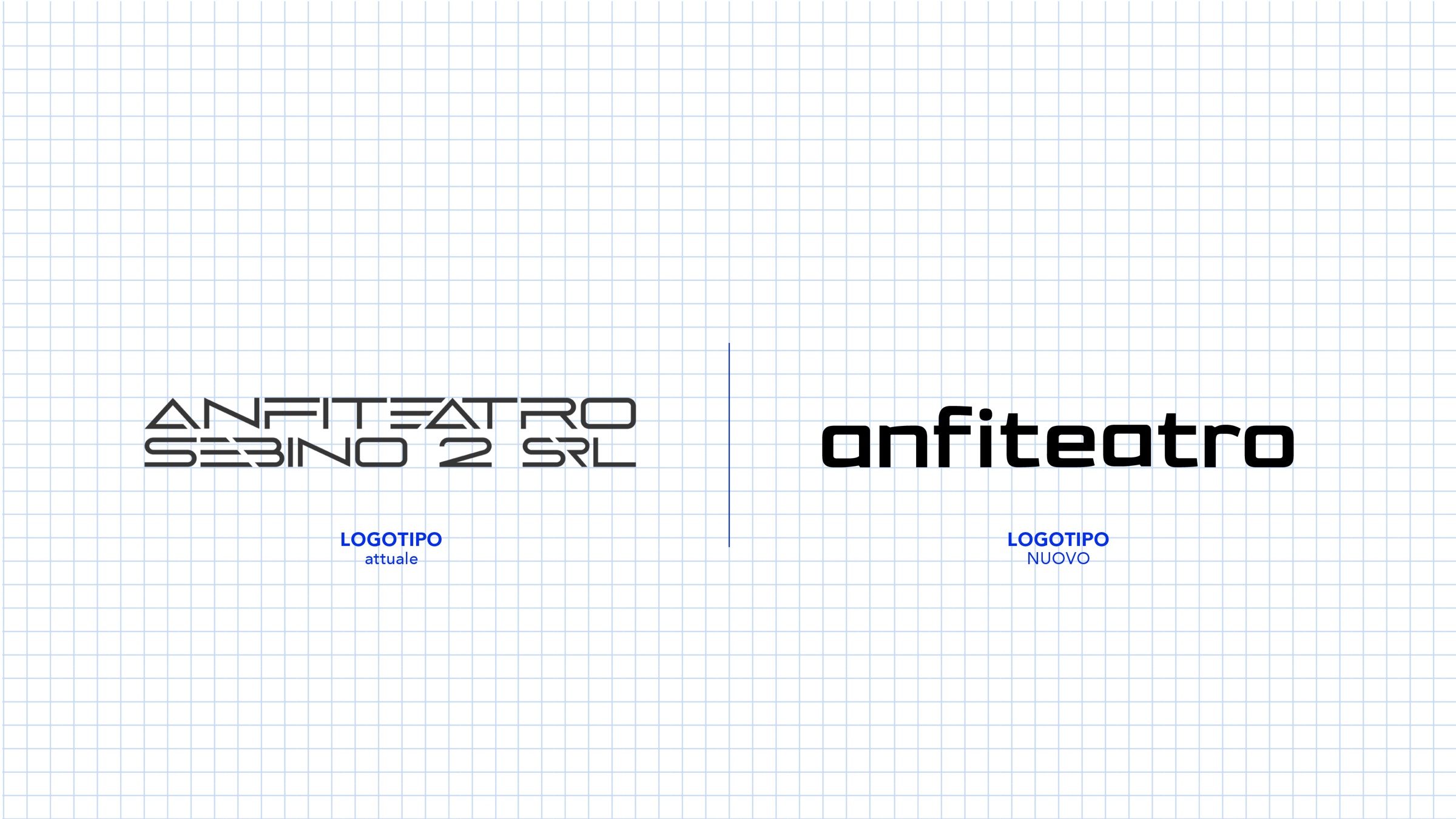
The original mark was complicated, lacked impact and was hard to read at small sizes.
- 02
A company that had changed
From construction to renewable energy: the mark had to bring together building, technology and sustainability.
- 03
Legible everywhere
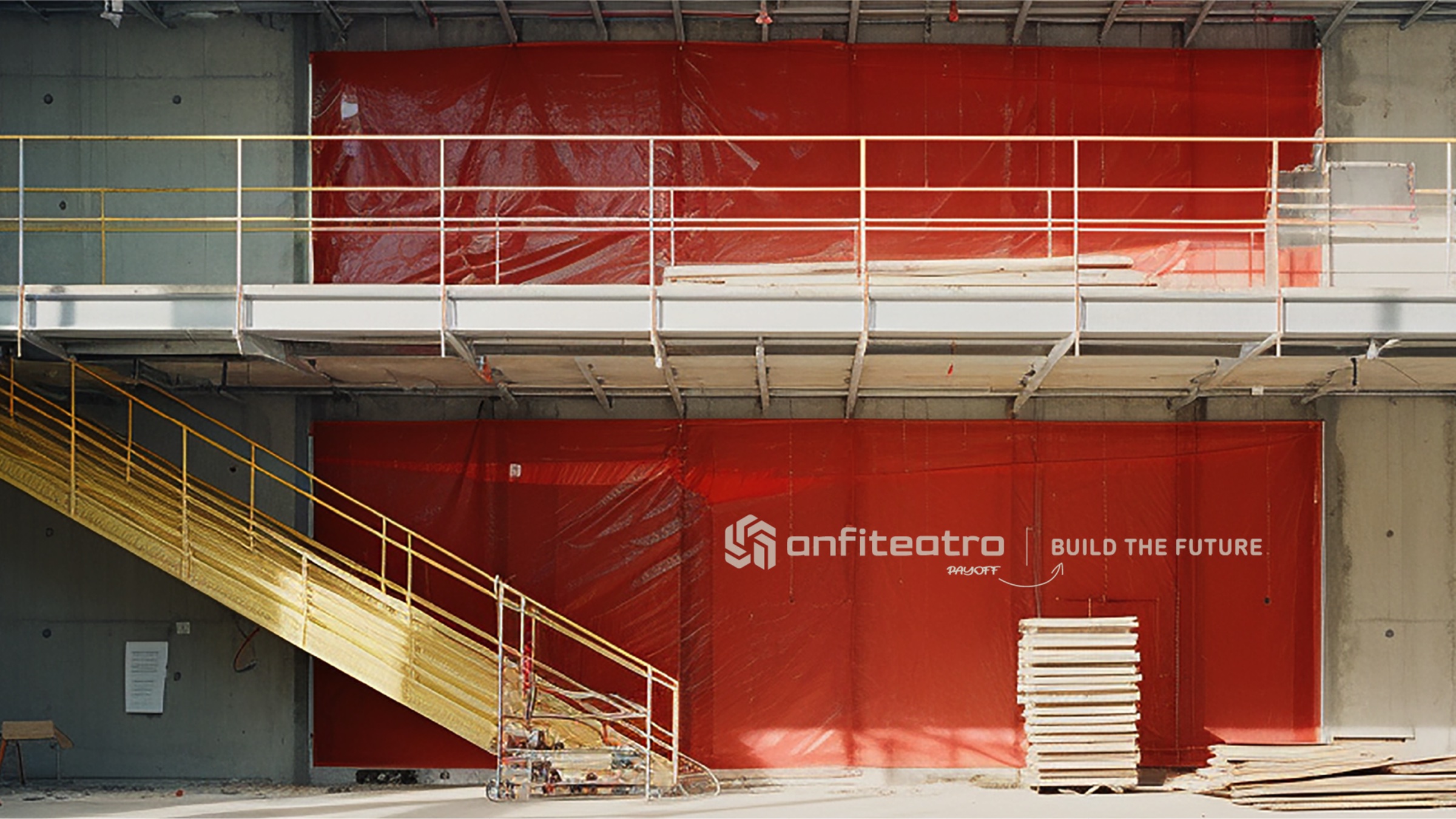
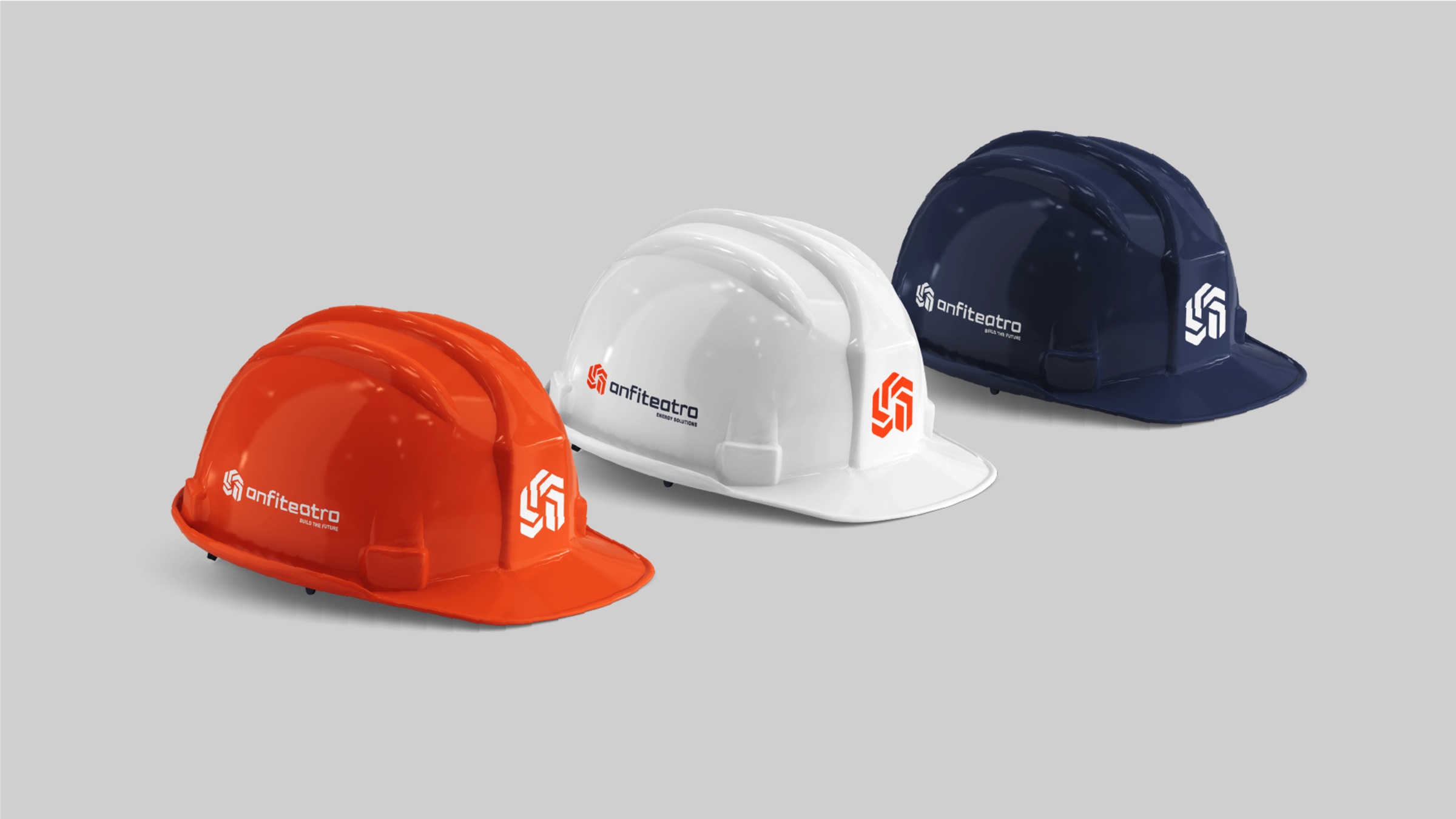
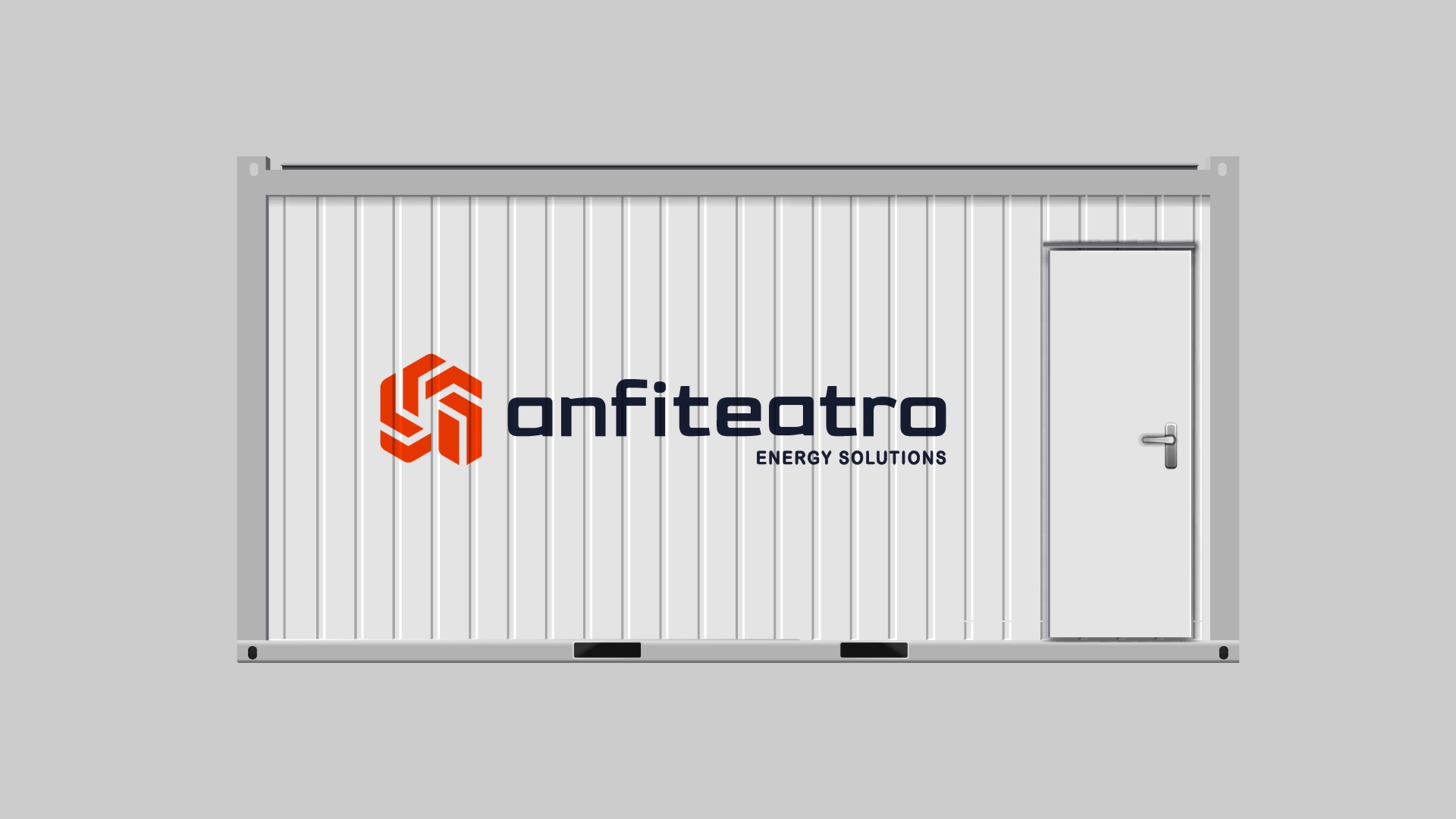
From business card to site hoarding, from hard hat to container: a logo that holds up even in a single colour.
Tailored solutions
What we developed.
- 01
Brand analysis
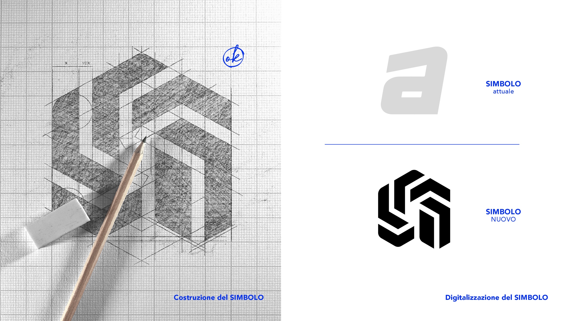
A critical review of the existing logo: superfluous elements, legibility, the character of the symbol.
- 02
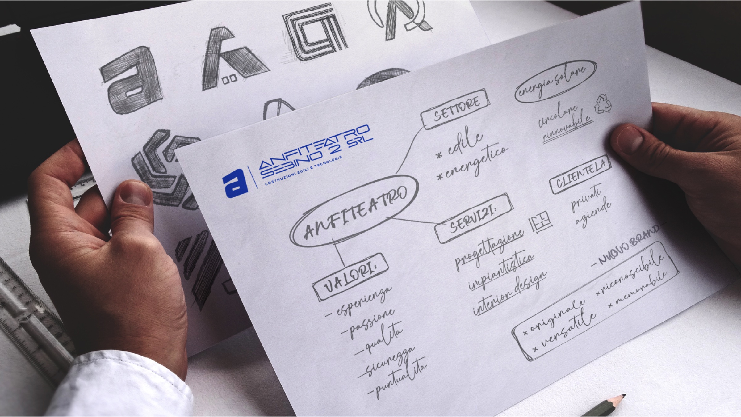
Symbol concept
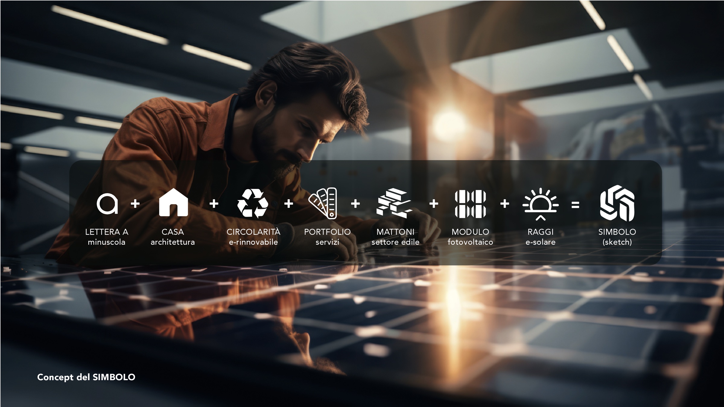
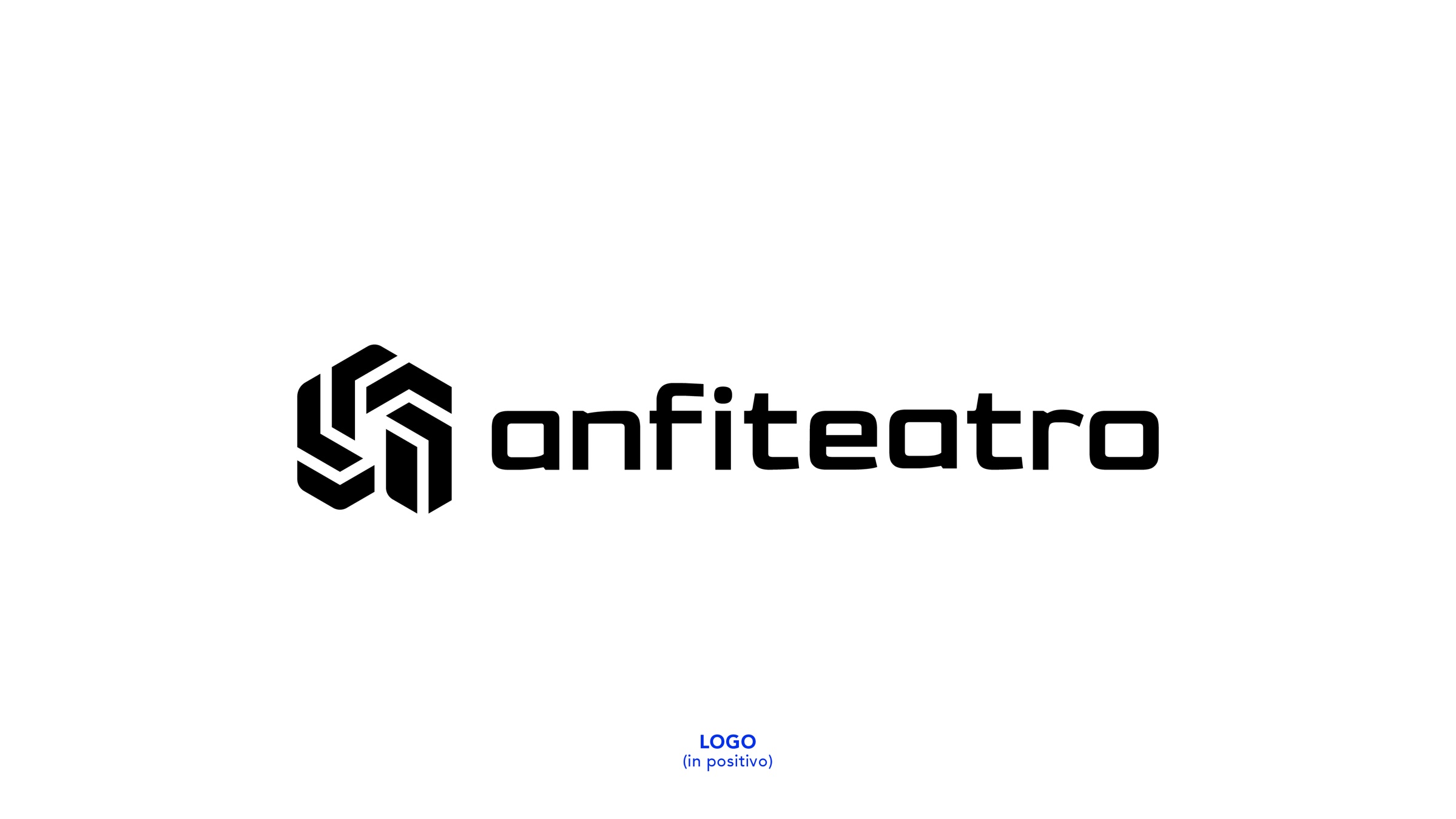
The letter a, the house, the circularity of renewables, bricks, the solar module and the sun’s rays distilled into a single monogram.
- 03
Naming and logotype
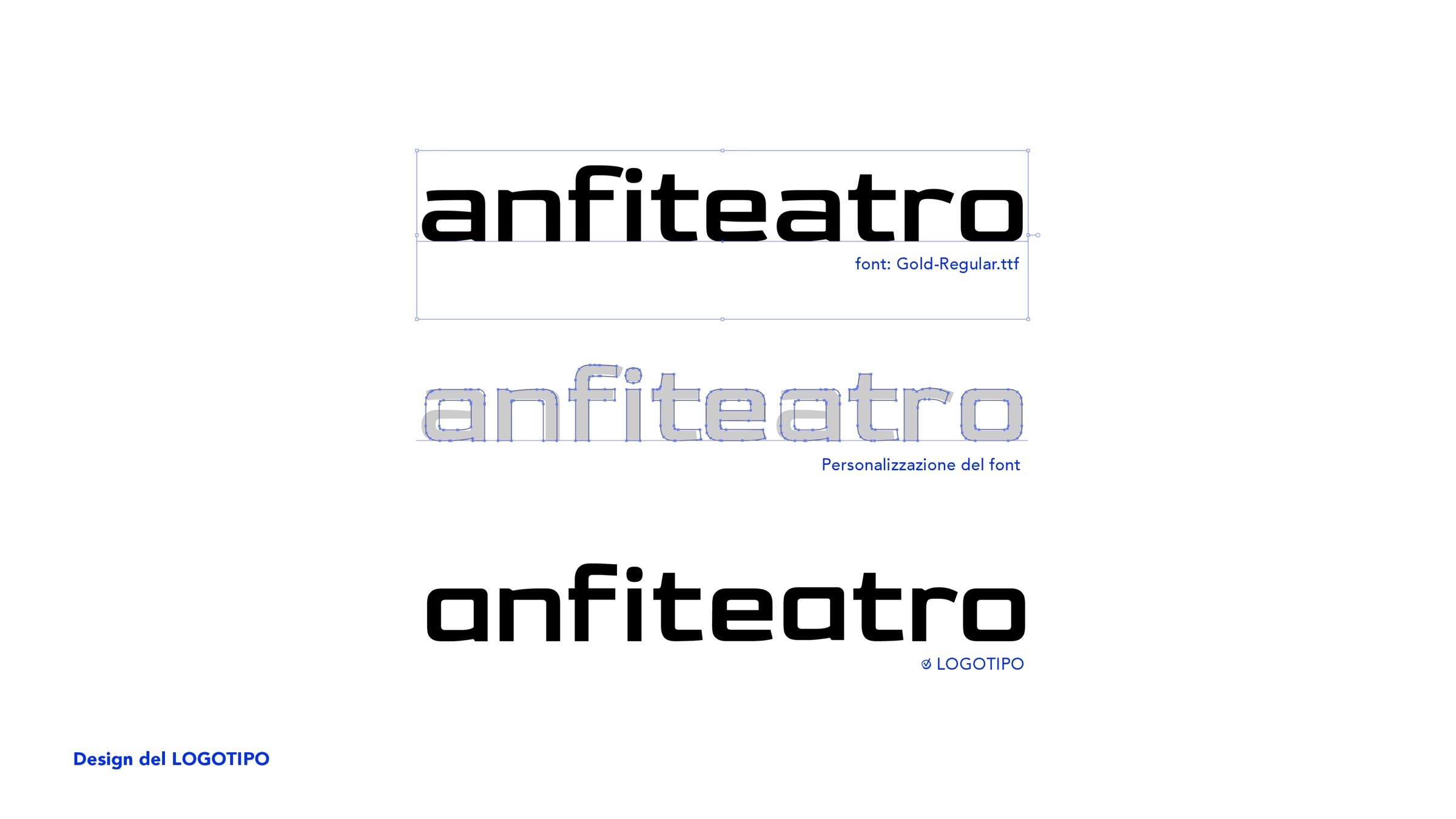
The name is simplified to anfiteatro, set in a custom typeface that echoes the geometry of the symbol.
- 04
Tagline
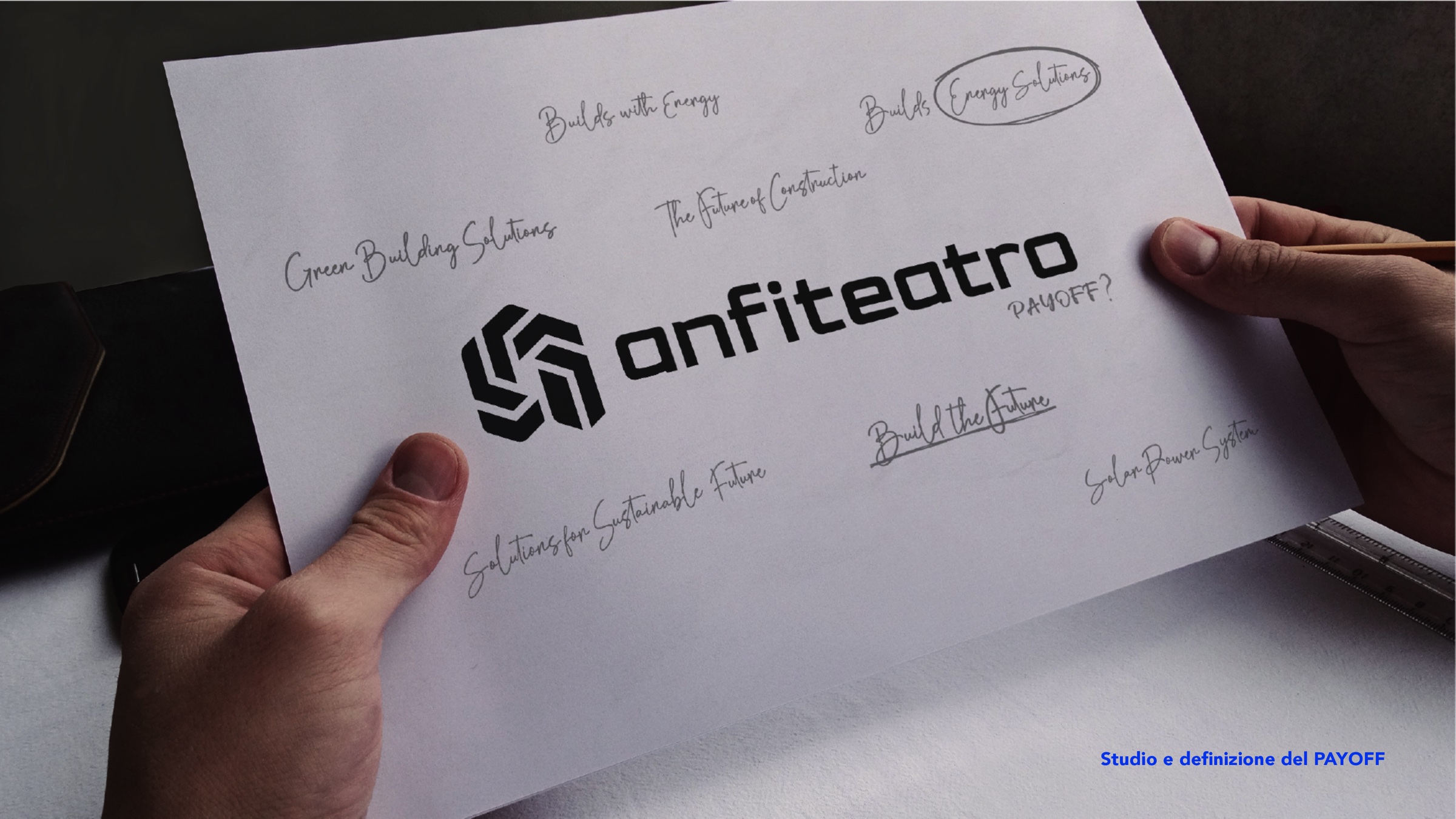
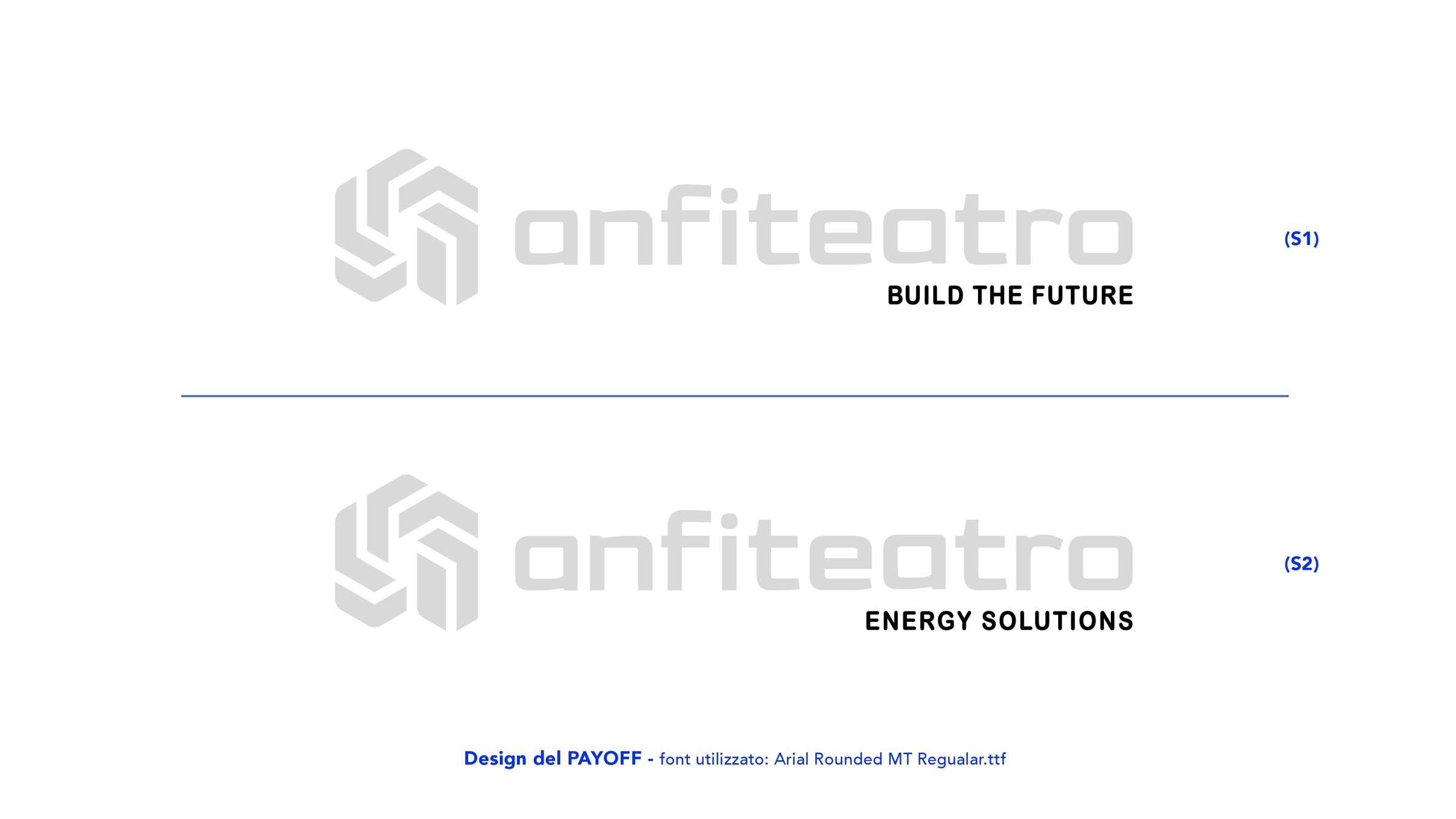
Two versions for the company’s two worlds: Build the future and Energy solutions.
- 05
Colour
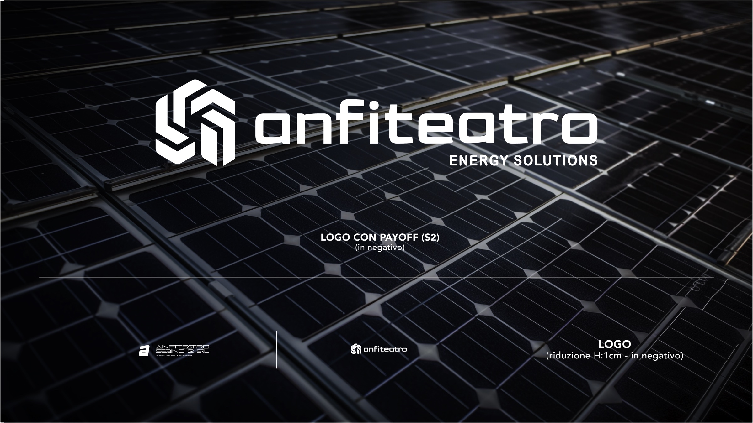
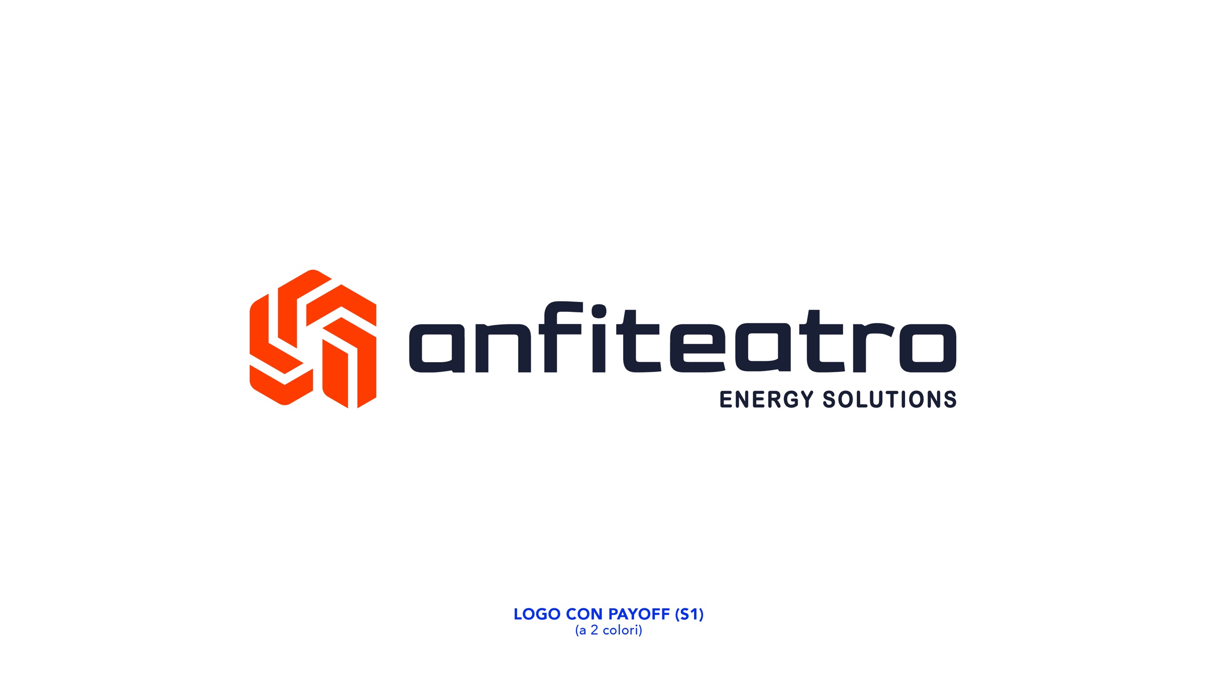
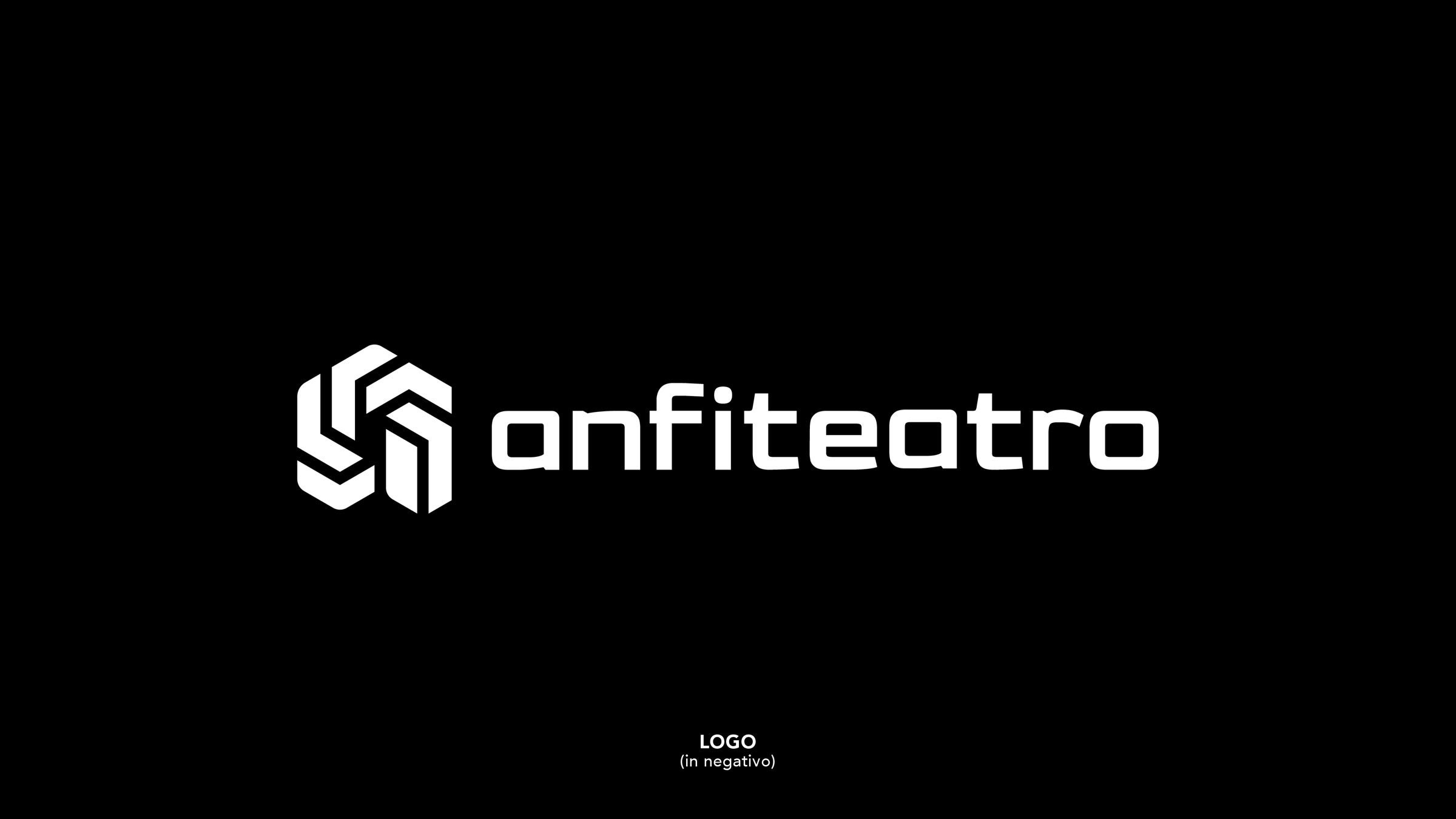
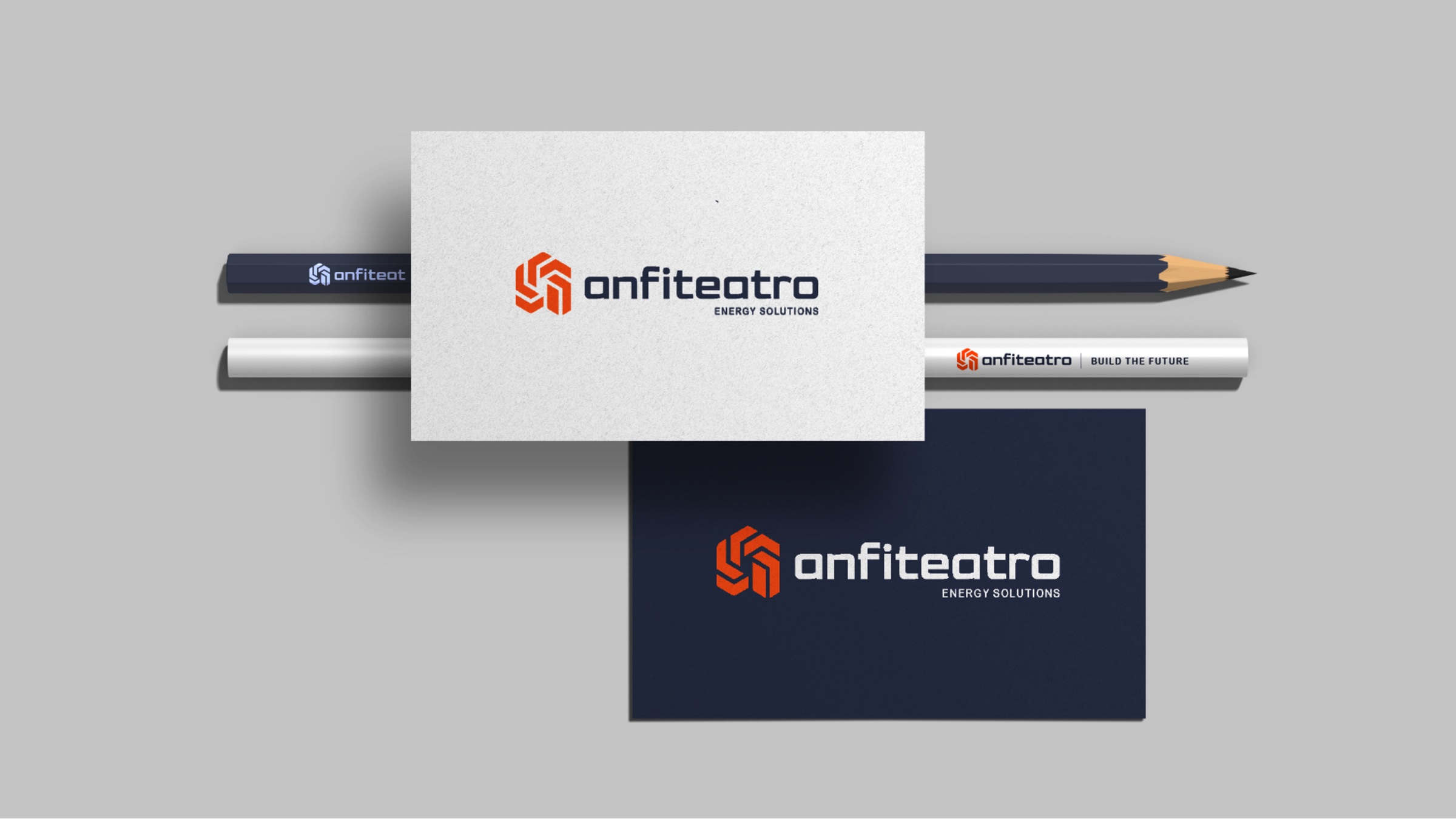
An energetic orange paired with black: a mark that works in positive, in negative and in one colour.
- 06
Applications
Business cards, stationery, hard hats, site hoardings and containers: the brand put to the test in the field.


Let’s talk
The next one
could be yours.
Tell us about your project: we’ll show you how we would approach it, with clear timescales and costs.